3 Visualizing Graphs
Now that we have learned how to define and store graphs, it’s time to take a look at ways of visualizing them. As we noted in earlier chapters, visualization is an important tool that can make graphs and networks real to others. But visualizations are not always effective. Graphs can be laid out and visualized in many different ways, and only some of them will effectively communicate the inferences or conclusions that the analyst is inviting others to draw about the phenomena being represented in the graph.
While a graph is made up of vertices and edges, there are many other factors that will impact how the graph appears. First, there are cosmetic matters of vertex size, edge thickness, whether or not vertices and edges are labelled, colored and so on. Second, there are matters of layout—that is, where we position vertices relative to each other in our visualization. As an example, recall our simple four vertex undirected graph \(G_\mathrm{work}\) from Section 2.1.1. Figure 3.1 shows two different ways of visualizing this graph, where we make different choices on vertex size and on graph layout24.
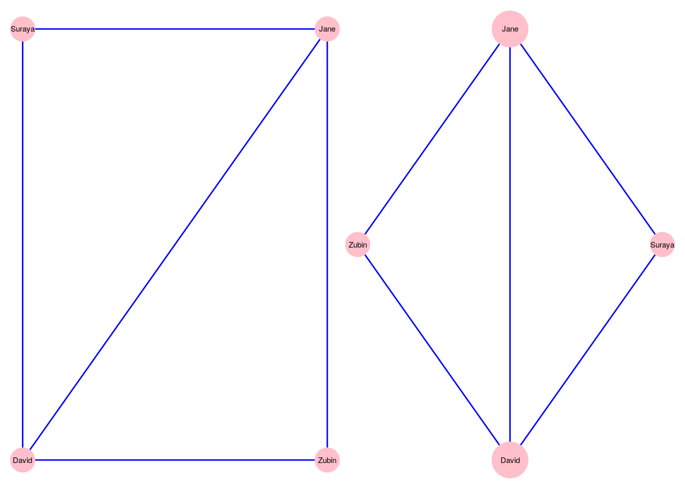
Figure 3.1: Two different ways of visualizing the \(G_\mathrm{work}\) graph
The choices of how to visualize a graph are wide and varied, and we will not be covering every single permutation and combination of cosmetics and layouts in the chapter. Instead, we will focus on learning how to control the most common options. This will equip readers well not just for work we do later in this book, but also for when they need to visualize graphs they create as part of their work or study. We will also cover a variety of graph visualization programming package options in R and Python.
In this chapter we will work with a relatively famous graph known as Zachary’s Karate Club. This graph originates from a piece of research on a karate club by social anthropologist Wayne W. Zachary25, and is commonly used as an example of a social network in many teaching situations today. The graph contains 34 vertices representing different individuals or actors. The karate instructor is labelled as ‘Mr Hi’. The club administrator is labelled as ‘John A’. The other 32 actors are labelled as ‘Actor 2’ through ‘Actor 33’. Zachary studied the social interactions between the members outside the club meetings, and during his study a conflict arose in the club that eventually led to the group splitting into two: one group forming a new club around the instructor Mr Hi and the other group dispersing to find new clubs or to give up karate completely. In this graph, an edge between two vertices means that the two individuals interacted socially outside the club.
3.1 Visualizing graphs in R
Let’s load the karate graph edgelist in R from the onadata package or from the internet26, and check the first few rows.
# get karate edgelist data as dataframe
karate_edgelist <- read.csv("https://ona-book.org/data/karate.csv")

head(karate_edgelist)
## from to
## 1 Mr Hi Actor 2
## 2 Mr Hi Actor 3
## 3 Mr Hi Actor 4
## 4 Mr Hi Actor 5
## 5 Mr Hi Actor 6
## 6 Mr Hi Actor 7Now let’s use our edgelist to create an undirected graph object in igraph.
## IGRAPH 6007ede UN-- 34 78 --
## + attr: name (v/c)
## + edges from 6007ede (vertex names):
##  [1] Mr Hi   --Actor 2  Mr Hi   --Actor 3  Mr Hi   --Actor 4  Mr Hi   --Actor 5  Mr Hi   --Actor 6
##  [6] Mr Hi   --Actor 7  Mr Hi   --Actor 8  Mr Hi   --Actor 9  Mr Hi   --Actor 11 Mr Hi   --Actor 12
## [11] Mr Hi   --Actor 13 Mr Hi   --Actor 14 Mr Hi   --Actor 18 Mr Hi   --Actor 20 Mr Hi   --Actor 22
## [16] Mr Hi   --Actor 32 Actor 2 --Actor 3  Actor 2 --Actor 4  Actor 2 --Actor 8  Actor 2 --Actor 14
## [21] Actor 2 --Actor 18 Actor 2 --Actor 20 Actor 2 --Actor 22 Actor 2 --Actor 31 Actor 3 --Actor 4
## [26] Actor 3 --Actor 8  Actor 3 --Actor 9  Actor 3 --Actor 10 Actor 3 --Actor 14 Actor 3 --Actor 28
## [31] Actor 3 --Actor 29 Actor 3 --Actor 33 Actor 4 --Actor 8  Actor 4 --Actor 13 Actor 4 --Actor 14
## [36] Actor 5 --Actor 7  Actor 5 --Actor 11 Actor 6 --Actor 7  Actor 6 --Actor 11 Actor 6 --Actor 17
## + ... omitted several edges
We can see that we have an undirected graph with 34 named vertices and 78 edges.
3.1.1 Native plotting in igraph
The igraph package allows simple plotting of graphs using the plot() function. The function works instantly with an igraph object, using default values for its various arguments. As a starting point, we will use all of the default values except for the layout of the graph. We will set the layout of the plot initially to be a random layout, which will randomly allocate the vertices to different positions. Figure 3.2 shows this default plot for our karate network.
# set seed for reproducibility
set.seed(123)

# create random layout
l <- layout_randomly(karate)

# plot with random layout
plot(karate, layout = l)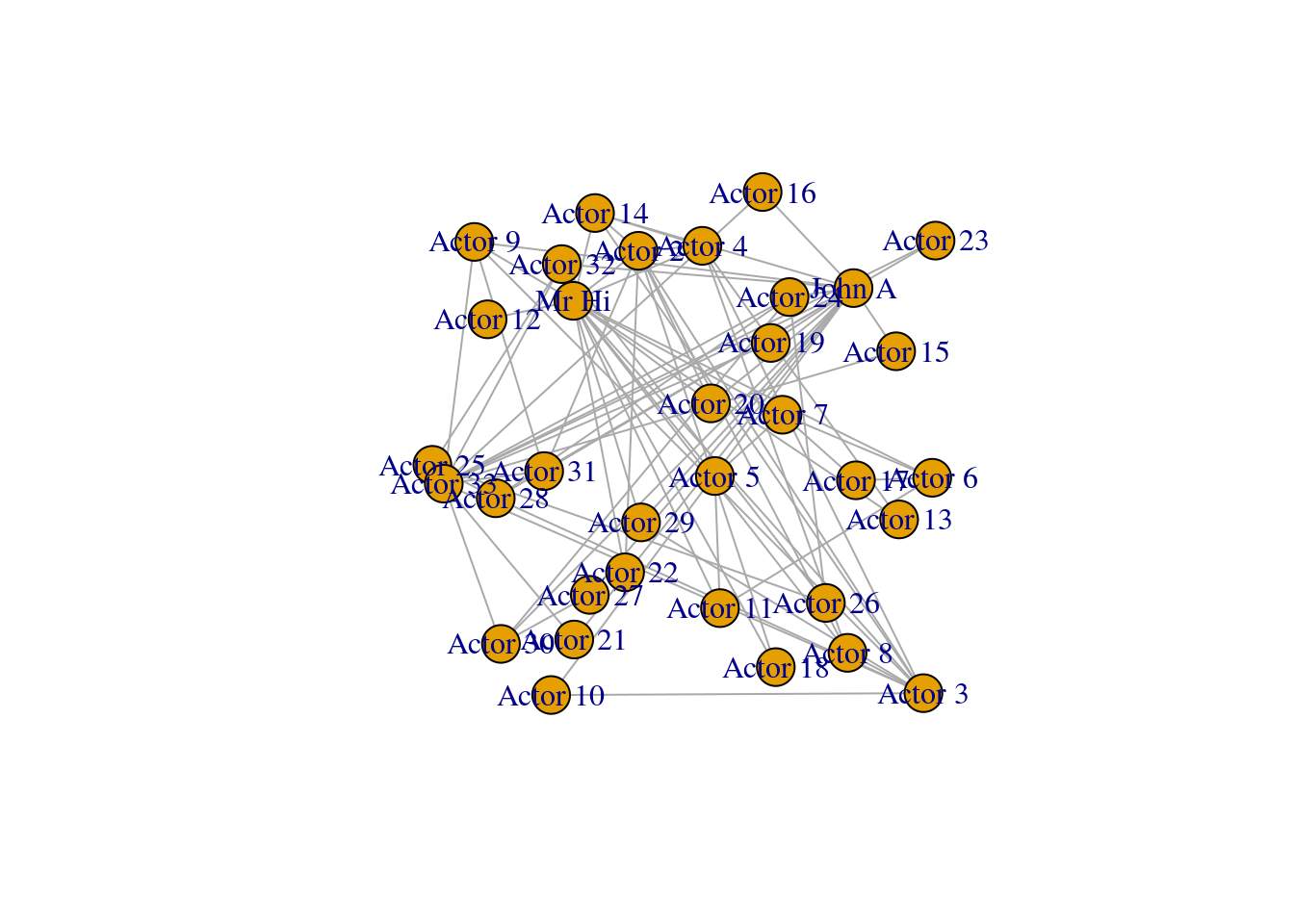
Figure 3.2: Basic default plot of karate network
Playing around: The previous code chunk fixes the positioning of the vertices on our karate graph. By setting a random seed, we can ensure the same random numbers are generated each time so that this precise plot is repeatable and reproducible. Then the layout_randomly() function calculates random x and y coordinates for the vertices, and when we use it in the plot() function, it assigns those coordinates in the plot. As we learn about layouts later in the chapter, we will use this technique a lot. If you like, try playing around with other layouts now. A couple of examples are layout_with_sugiyama() and layout_with_dh(). Remember to always set the same seed whenever you generate a graph layout calculation to ensure that your visualization in reproducible by yourself or others.
Looking at Figure 3.2, we note that the labeling of the vertices is somewhat obtrusive and unhelpful to the clarity of the graph. This will be a common problem with default graph plotting, and with a large number of vertices the plot can easily turn into a messy cloud of overlapping labels.
Vertex labels can be adjusted via properties of the vertices. The most common properties adjusted are as follows:
label: The text of the labellabel.family: The font family to be used (default is ‘serif’)label.font: The font style, where 1 is plain (default), 2 is bold, 3 is italic, 4 is bold and italic and 5 is symbol fontlabel.cex: The size of the label textlabel.color: The color of the label textlabel.dist: The distance of the label from the vertex, where 0 is centered on the vertex (default) and 1 is beside the vertexlabel.degree: The angle at which the label will display relative to the center of the vertex, in radians. The default is-pi/4
Let’s try to change the vertex labels so that they only display for Mr Hi and for John A. Let’s also change the size, color and font family of the labels. The output can be seen in Figure 3.3.
# only store a label if Mr Hi or John A
V(karate)$label <- ifelse(V(karate)$name %in% c("Mr Hi", "John A"),
                          V(karate)$name,
                          "")

# change label font color, size and font family
# (selected font family needs to be installed on system)
V(karate)$label.color <- "black"
V(karate)$label.cex <- 0.8
V(karate)$label.family <- "arial"

plot(karate, layout = l)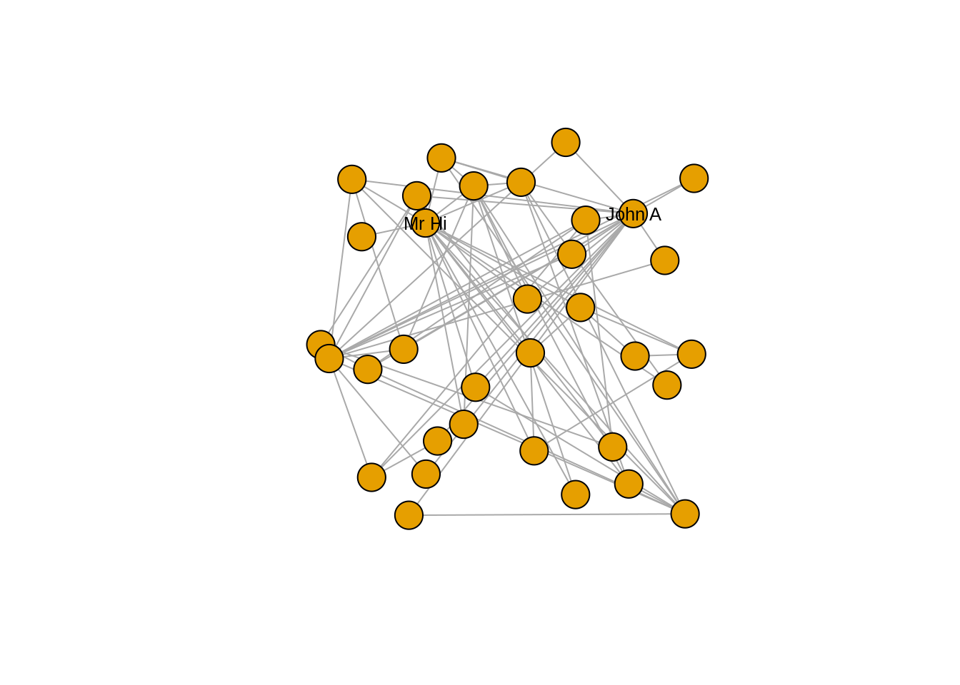
Figure 3.3: Adjusting label appearance through changing vertex properties
Now that we have cleaned up the label situation, we may wish to change the appearance of the vertices. Here are the most commonly used vertex properties which allow this:
size: The size of the vertexcolor: The fill color of the vertexframe.color: The border color of the vertexshape: The shape of the vertex; multiple shape options are supported includingcircle,square,rectangleandnone
We may wish to use different vertex shapes and colors for our actors compared to Mr Hi and John A. This is how this would be done, with the results in Figure 3.4.
# different colors and shapes for Mr Hi and and John A
V(karate)$color <- ifelse(V(karate)$name %in% c("Mr Hi", "John A"),
                          "lightblue",
                          "pink")

V(karate)$shape <- ifelse(V(karate)$name %in% c("Mr Hi", "John A"),
                          "square",
                          "circle")


plot(karate, layout = l)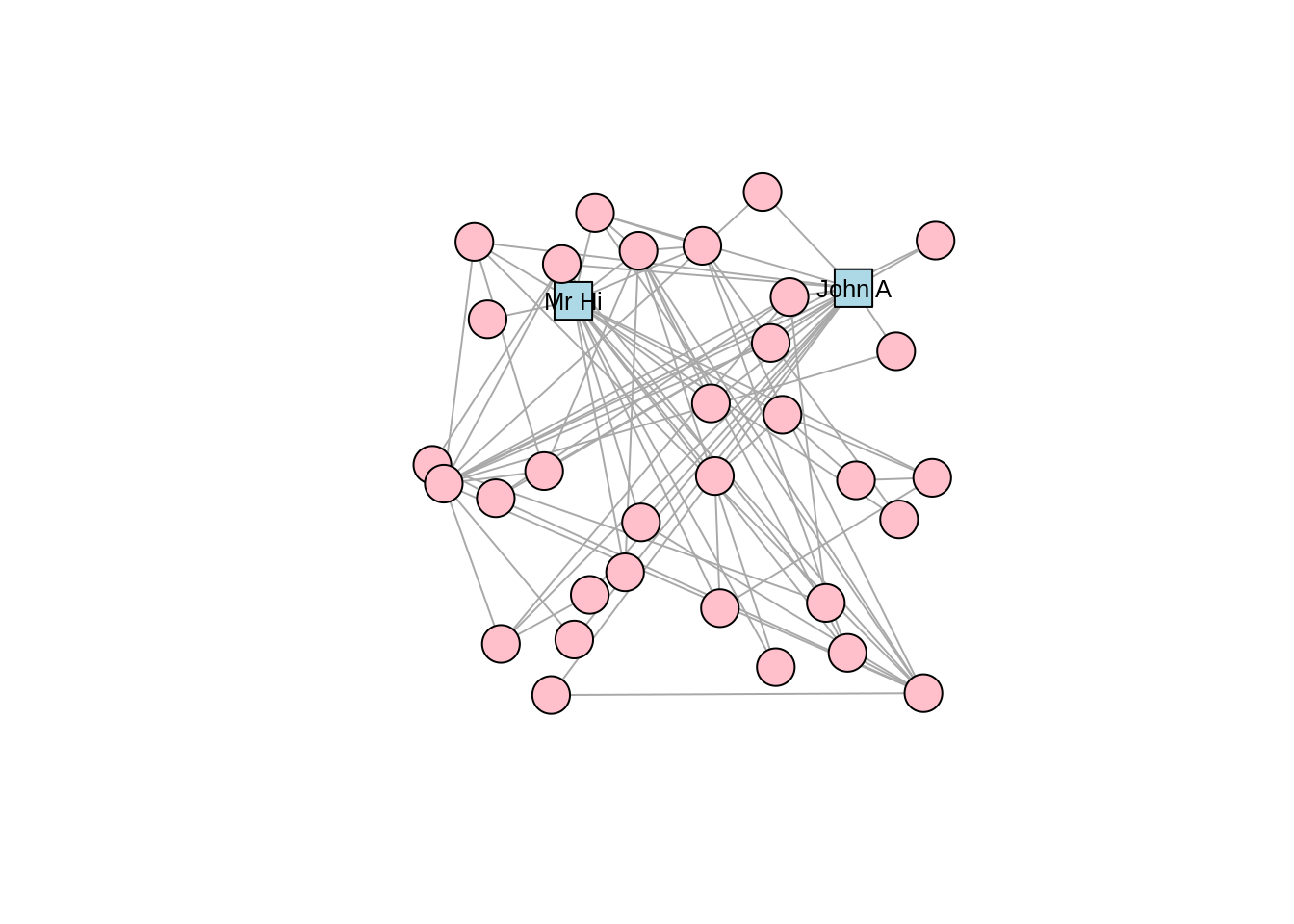
Figure 3.4: Adjusting vertex appearance through changing vertex properties
In a similar way, edges can be changed through adding or editing edge properties. Here are some common edge properties that are used to change the edges in an igraph plot:
color: The color of the edgewidth: The width of the edgearrow.size: The size of the arrow in a directed edgearrow.width: The width of the arrow in a directed edgearrow.mode: Whether edges should direct forward (>), backward (<) or both (<>)lty: Line type of edges, with numerous options includingsolid,dashed,dotted,dotdashandblankcurved: The amount of curvature to apply to the edge, with zero (default) as a straight edge, negative numbers bending clockwise and positive bending anti-clockwise
Note that edges, like vertices, can also have a label property and various label settings like label.cex and label.family. Let’s adjust our karate graph to have blue dashed edges, with the result in Figure 3.5.
# change color and linetype of all edges
E(karate)$color <- "blue"
E(karate)$lty <- "dashed"

plot(karate, layout = l)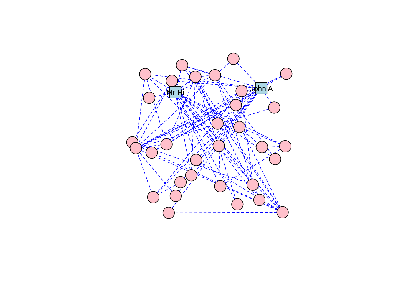
Figure 3.5: Adjusting edge appearance through changing edge properties
Playing around: Usually, getting your graph looking the way you want takes some trial and error and some playing around with its properties. Try further adjusting the karate graph using some of the other properties listed.
3.1.2 Graph layouts
The layout of a graph determines the precise position of its vertices on a 2-dimensional plane or in 3-dimensional space. Layouts are themselves algorithms that calculate vertex positions based on properties of the graph. Different layouts work for different purposes, for example to visually identify communities in a graph, or just to make the graph look pleasant. In Section 3.1.1, we used a random layout for our karate graph. Now let’s look at common alternative layouts. Layouts are used by multiple plotting packages, but we will explore them using igraph base plotting capabilities here.
There are two ways to add a layout to a graph in igraph. If you want to keep the graph object separate from the layout, you can create the layout and use it as an argument in the plot() function, like we did for Figure 3.2. Alternatively, you can assign a layout to a graph object by making it a property of the graph. You should only do this if you intend to stick permanently with your chosen layout and do not intend to experiment. You can use the add_layout_() function to achieve this. For example, this would create a karate graph with a grid layout.
## NULL# assign grid layout as a graph property
set.seed(123)
karate_grid <- igraph::add_layout_(karate, on_grid())
# check a few lines of the 'layout' property
head(karate_grid$layout)## [,1] [,2]
## [1,] 0 0
## [2,] 1 0
## [3,] 2 0
## [4,] 3 0
## [5,] 4 0
## [6,] 5 0We can see that our new graph object has a layout property. Note that running add_layout_() on a graph that already has a layout property will by default overwrite the previous layout unless you set the argument overwrite = FALSE.
As well as the random layout demonstrated in Figure 3.2, common shape layouts include as_star(), as_tree(), in_circle(), on_grid() and on_sphere(). For example, Figure 3.6 shows the circle layout for our karate network, and Figure 3.7 shows the sphere layout.
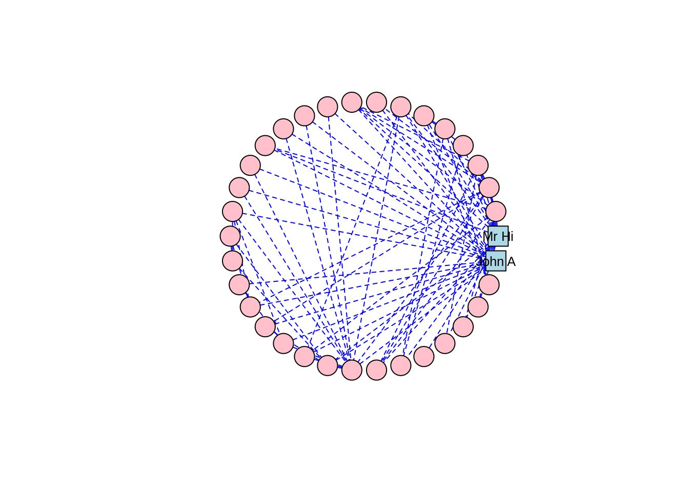
Figure 3.6: Circle layout of the karate graph
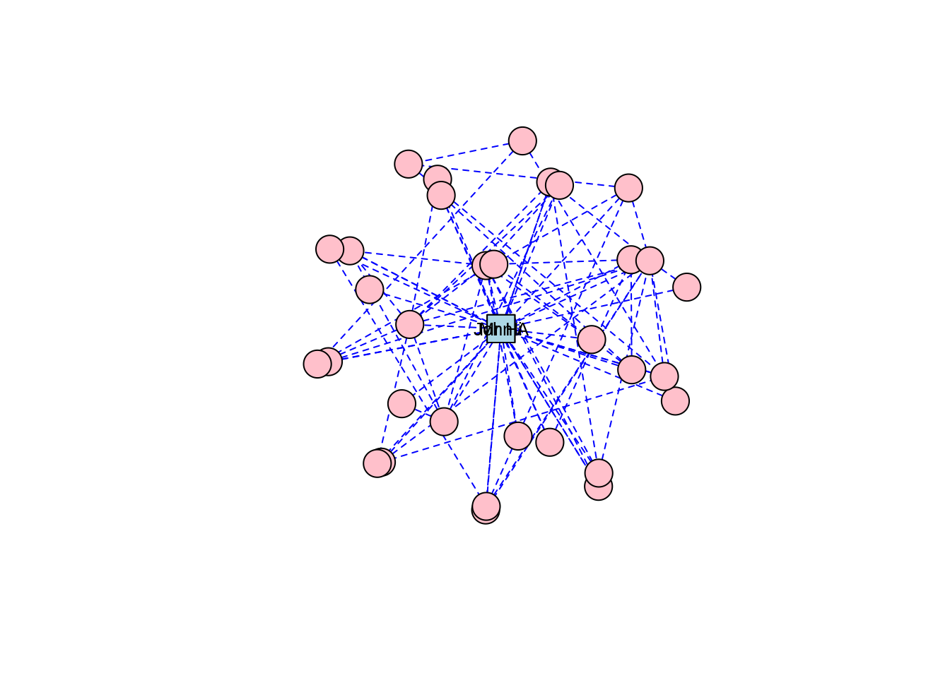
Figure 3.7: Sphere layout of the karate graph
Thinking ahead: Notice how the circle and sphere layouts position Mr Hi and John A very close to each other. This is an indication that the layout algorithms have established something in common between these two individuals based on the properties of the graph. This is something we will cover in a later chapter, but if you want to explore ahead, and you know how to, calculate some centrality measures for the vertices in the karate graph—for example degree centrality and betweenness centrality.
Force-directed graph layouts are extremely popular, as they are aesthetically pleasing and they help visualize communities of vertices quite effectively, especially in graphs with low to moderate edge complexity. These algorithms emulate physical models like Hooke’s law to attract connected vertices together, at the same time applying repelling forces to all pairs of vertices to try to keep as much space as possible between them. This calculation is an iterative process where vertex positions are calculated again and again until equilibrium is reached27. The result is usually a layout where connected vertices are closer together and where edge lengths are approximately equal.
For Zachary’s Karate Club study, which was a study of connection and community, we can imagine that a force-directed layout would be a good choice of visualization, and we will find that this is the case for many other network graphs we study. There are several different implementations of force-directed algorithms available. Perhaps the most popular of these is the Fruchterman-Reingold algorithm. Figure 3.8 shows our karate network with the layout generated by the Fruchterman-Reingold algorithm, and we can see clear communities in the karate club oriented around Mr Hi and John A.
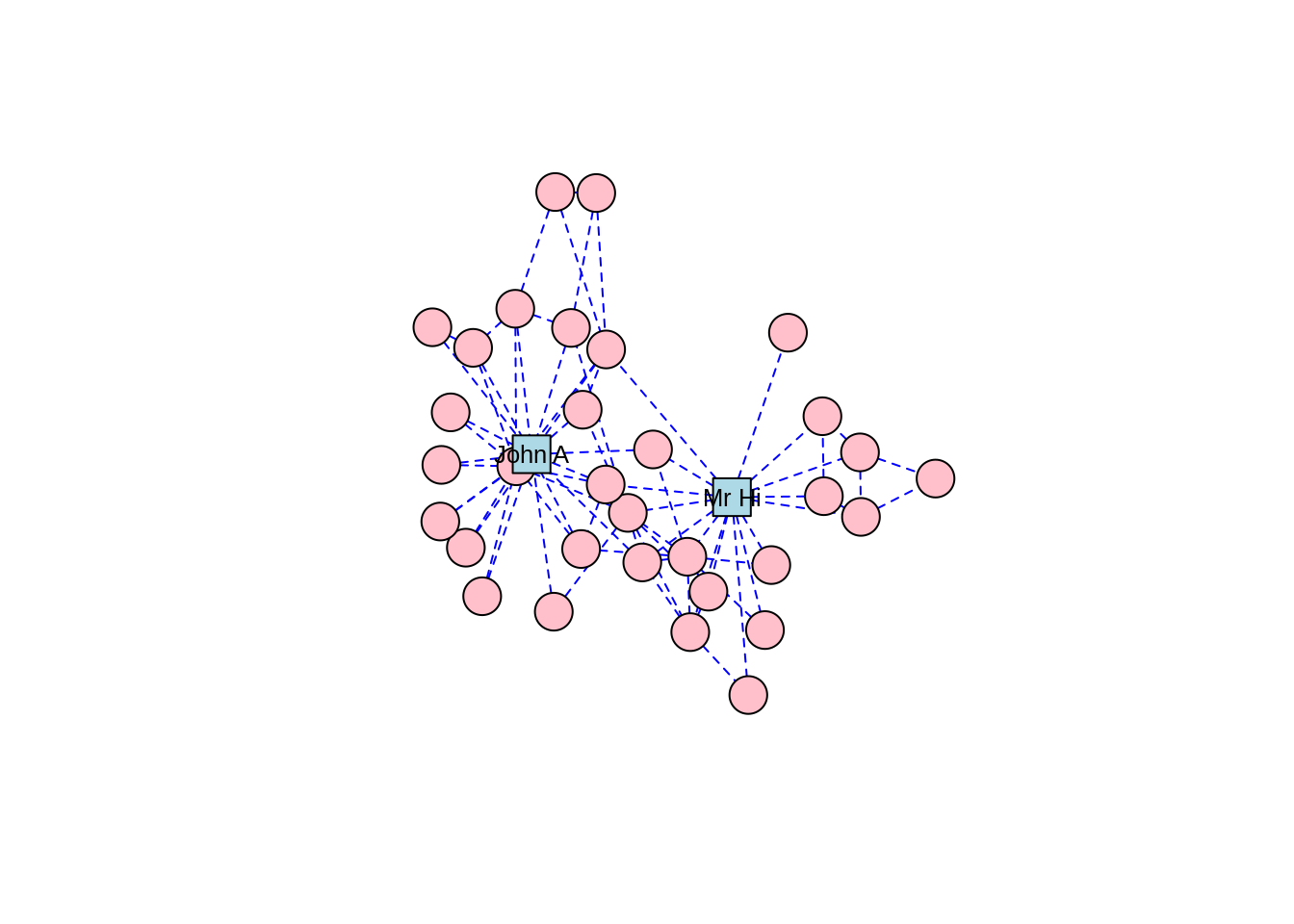
Figure 3.8: Force-directed layout of the karate graph according to the Fruchterman-Reingold algorithm
The Kamada-Kawai algorithm and the GEM algorithm are also commonly used force-directed algorithms and they produce similar types of community structures as in Figures 3.9 and 3.10, respectively.
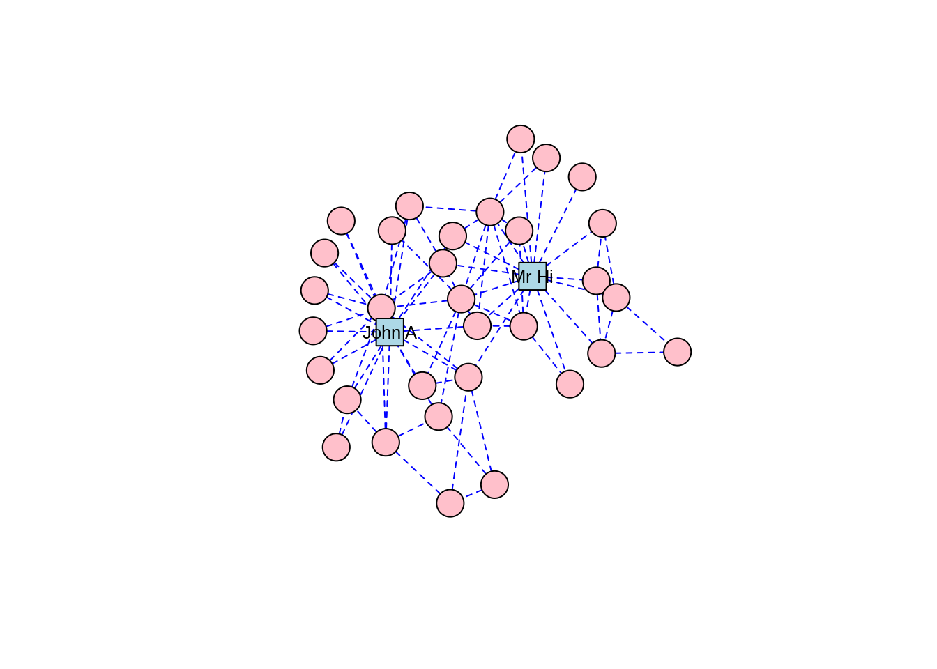
Figure 3.9: Force-directed layout of the karate graph according to the Kamada-Kawai algorithm
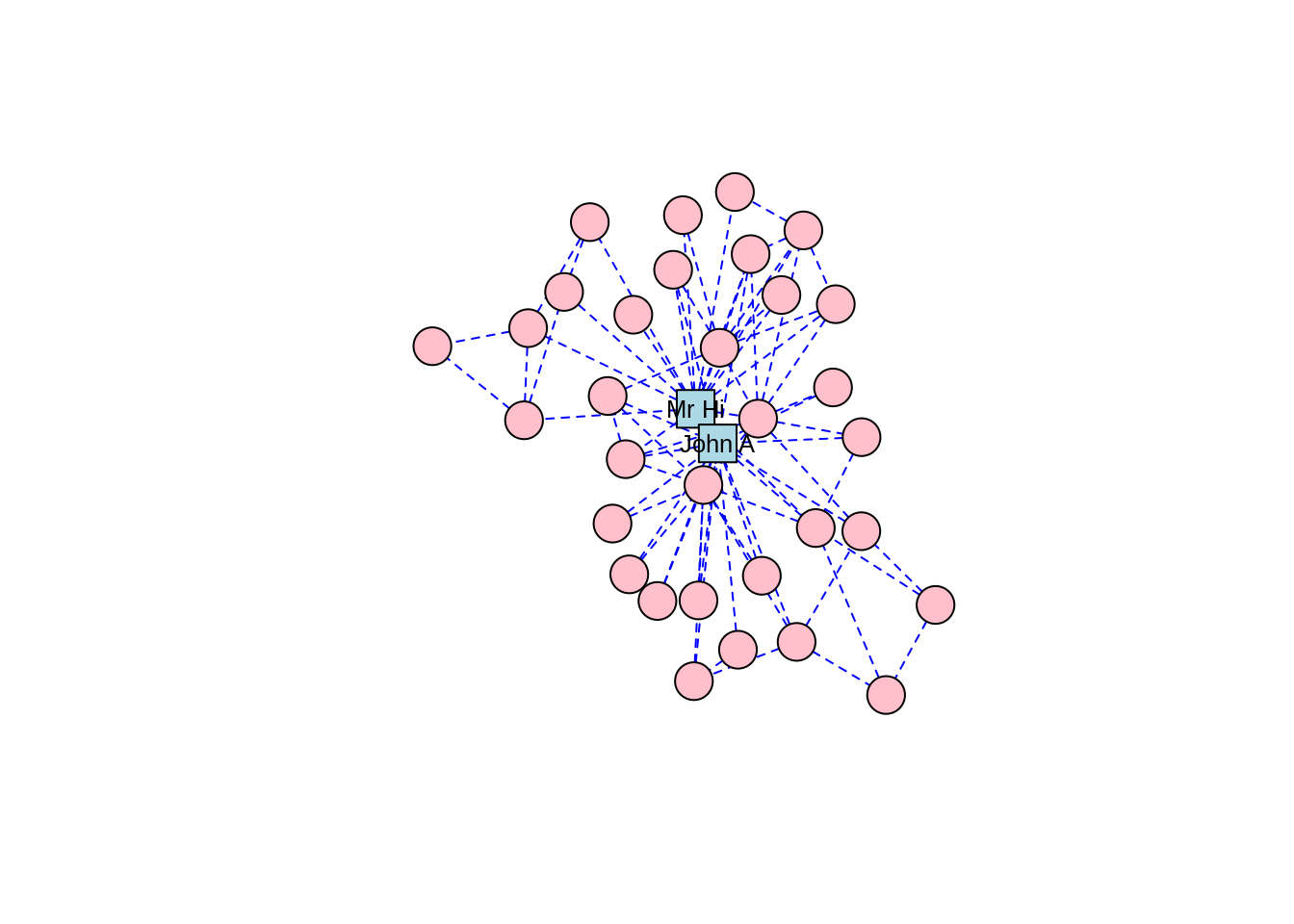
Figure 3.10: Force-directed layout of the karate graph according to the GEM algorithm
As well as force-directed and shape-oriented layout algorithms, several alternative approaches to layout calculations are also available. layout_with_dh() uses a simulated annealing algorithm developed for nice graph drawing, and layout_with_mds() generates vertex coordinates through multidimensional scaling based on shortest path distance (which we will look at in a later chapter). layout_with_sugiyama() is suitable for directed graphs and minimizes edge crossings by introducing bends on edges28.
Finally, there are three layout algorithms that are suited for large graphs with many thousands or even millions of edges. One of the biggest problems with visualizing large graphs is the potential for ‘hairballs’—that is, clumps of connected nodes that are so dense they cannot be usefully visualized. layout_with_lgl() uses the Large Graph Layout algorithm which tries to identify clusters of vertices and position the clusters before positioning the individual vertices to minimize the chance of hairballs, while still adhering to the principles of force-directed networks. layout_with_drl() and layout_with_graphopt() also use efficient force-directed algorithms which scale well on large graphs.
Playing around: Try laying out the karate graph using these various algorithms and observe the different appearances. If you are interested in experimenting with a larger graph, and you have enough computing power that it won’t freeze your machine, load the wikivote edgelist from the onadata package, or download it from the internet29. This network represents votes from Wikipedia members for other members to be made administrators. Create a directed graph object, and lay it out using layout_with_graphopt(). To help with your visualization, remove the vertex labels, set the node size to 0.5 and set the edge arrow size to 0.1. When you plot this, you should see a great example of a hairball, as in Figure 3.11.
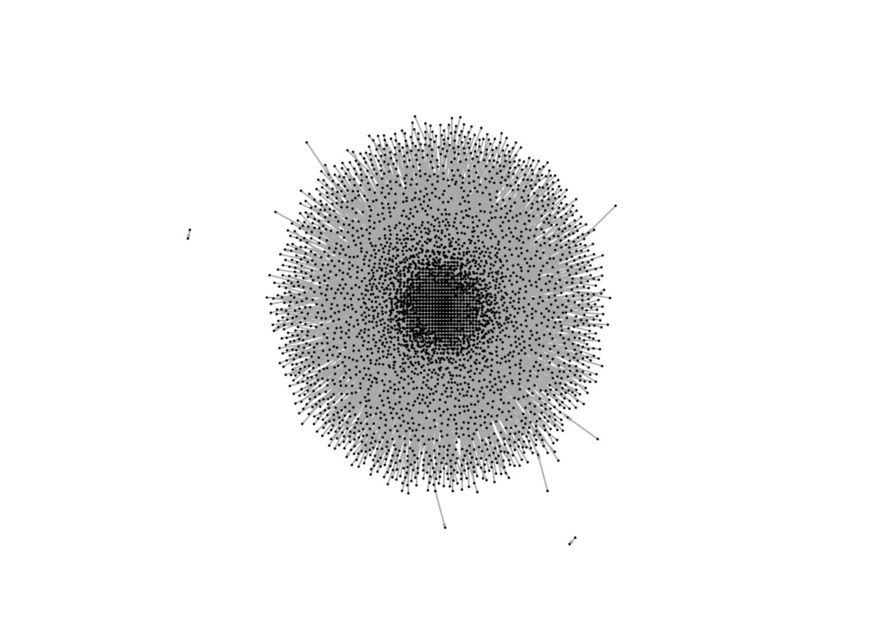
Figure 3.11: Example of a hairball generated by trying to visualize a large network of Wikipedia votes for administrators
In the absence of any information on layout, the plot() function in igraph will choose an appropriate layout using a logic determined by layout_nicely(). If the graph already has a layout attribute, it will use this layout. Otherwise, if the vertices have x and y attributes, it will use these as vertex coordinates. Failing both of these, layout_with_fr() will be used if the graph has fewer than 1,000 vertices, and layout_with_drl() will be used if the graph has more than 1,000 vertices. Thus, the plot defaults to a form of force-directed layout unless the graph attributes suggest otherwise.
3.1.3 Static plotting with ggraph
The ggraph package is developed for those who enjoy working with the more general ggplot2 package, which is a very popular plotting package in R30. As with ggplot2, ggraph provides a grammar for building graph visualizations. While the native capabilities of igraph will suffice in R for most static graph visualizations, ggraph could be considered an additional option for those who prefer to use it. It also integrates well with ggplot2 which allows further layers to be added to the graph visualization, such as a greater variety of node shapes and the ability to layer networks onto geographic maps with relative ease.
To build an elementary graph using ggraph, we start with an igraph object and a layout, and we then progressively add node and edge properties as well as themes and other layers if required. To illustrate, let’s generate a relatively basic visualization of our karate graph using ggraph as in Figure 3.12. Note that it is customary to add the edges before the vertices so that the vertices are the top layer in the plot.
library(igraph)
library(ggraph)

# get karate edgelist
karate_edgelist <- read.csv("https://ona-book.org/data/karate.csv")

# create graph object
karate <- igraph::graph_from_data_frame(karate_edgelist,
                                        directed = FALSE)

# set seed for reproducibility
set.seed(123)

# visualise using ggraph with fr layout
ggraph(karate, layout = "fr") +
  geom_edge_link() +
geom_node_point() 
Figure 3.12: Elementary visualization of karate graph using ggraph and the Fruchterman-Reingold algorithm
This is not particularly appealing. However, we can play with properties to improve the appearance, and we can move to a minimal theme to remove the grey background and add a title if we wish, as in Figure 3.13.
set.seed(123)
ggraph(karate, layout = "fr") +
  geom_edge_link(color = "grey", alpha = 0.7) +
  geom_node_point(color = "blue", size = 5) +
  theme_void() +
  labs(title = "Zachary's Karate Club Network")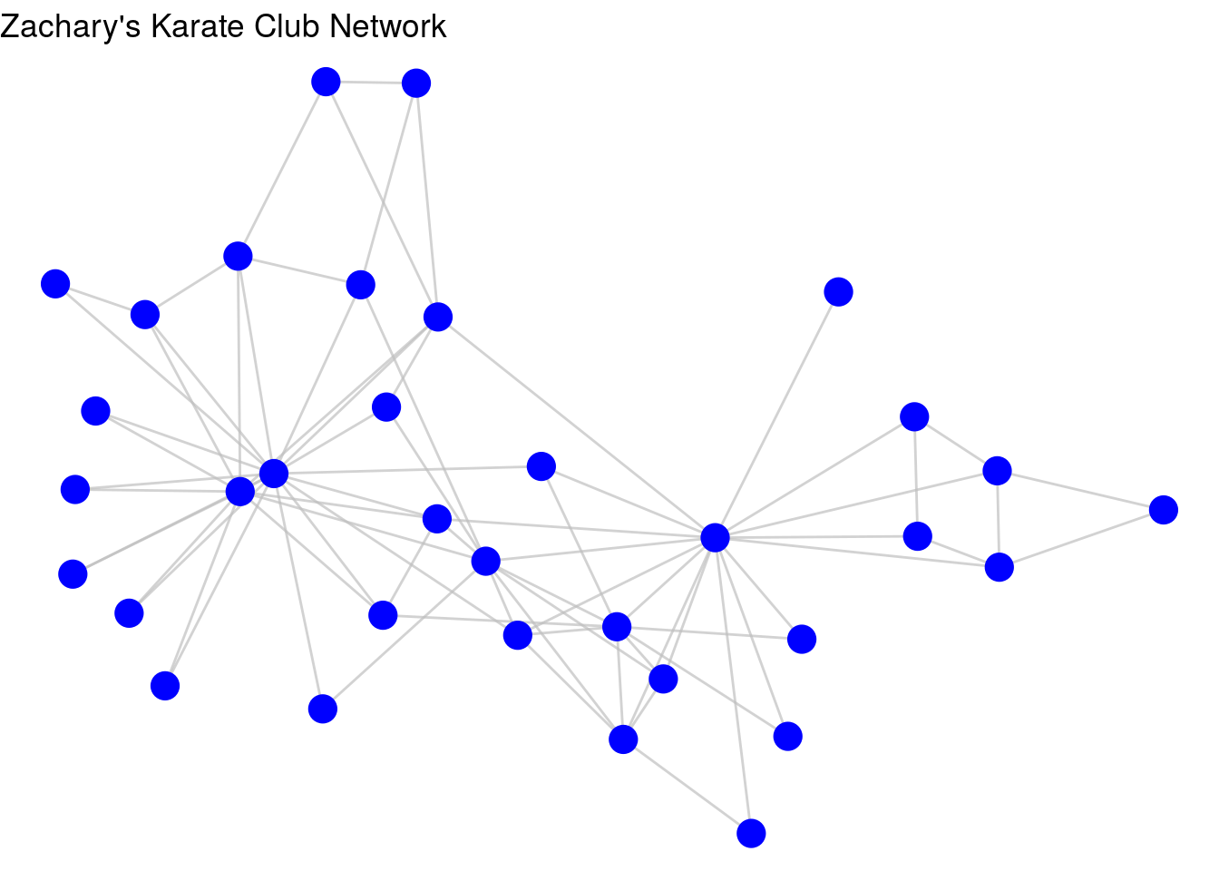
Figure 3.13: Improved visualization of karate graph using node and edge geom functions
Like in ggplot2, if we want to associate a property of the nodes or edges with a property of the plot, we can use aesthetic mappings. For example, let’s give Mr Hi and John A the property of “leader” in our graph, and then ask ggraph to color the nodes by this property, as in Figure 3.14.
V(karate)$leader <- ifelse(
  V(karate)$name %in% c("Mr Hi", "John A"), 1, 0
)

set.seed(123)
ggraph(karate, layout = "fr") +
  geom_edge_link(color = "grey", alpha = 0.7) +
  geom_node_point(aes(color = as.factor(leader)), size = 5,
                  show.legend = FALSE) +
  theme_void() +
  labs(title = "Zachary's Karate Club Network")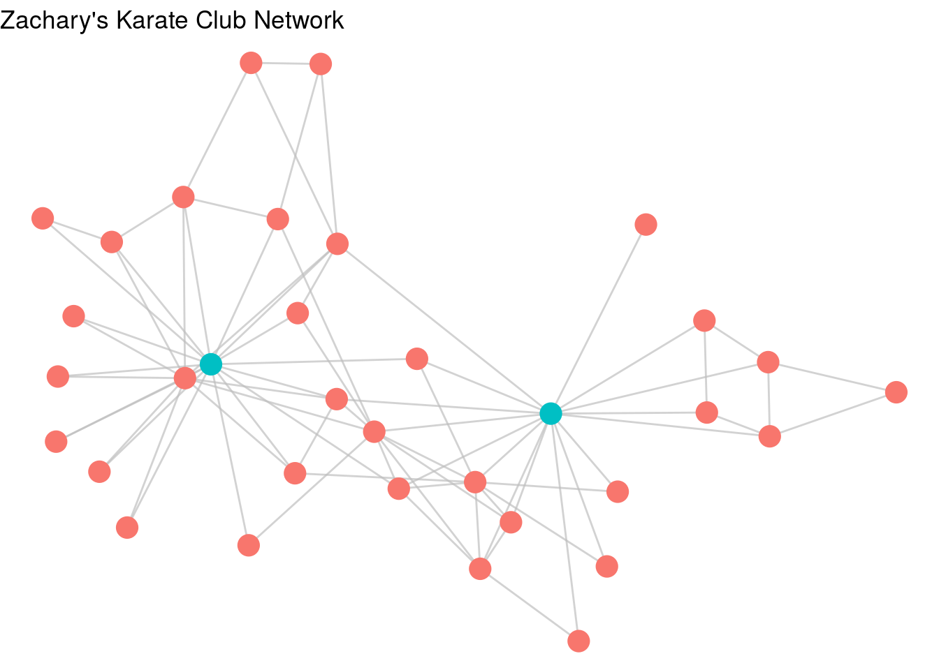
Figure 3.14: karate graph with leader property used as an aesthetic
As a further example of using ggraph, let’s look at a data set collected during a study of workplace interactions in France in 201531. Load the workfrance_edgelist and workfrance_vertices data sets from the onadata package or download them from the internet32. In this study, employees of a company wore wearable devices to triangulate their location in the building, and edges were defined as any situation where two employees were sharing the same spatial location. The edgelist contains from and to columns for the edges, as well as a mins column representing the total minutes spent co-located during the study33. The vertex list contains ground-truth data on the department of each employee. We will create a basic visualization of this using ggraph in Figure 3.15.
# get edgelist with mins property
workfrance_edgelist <- read.csv(
  "https://ona-book.org/data/workfrance_edgelist.csv"
)

# get vertex set with dept property
workfrance_vertices <- read.csv(
  "https://ona-book.org/data/workfrance_vertices.csv"
)

# create undirected graph object
workfrance <- igraph::graph_from_data_frame(
  d = workfrance_edgelist,
  vertices = workfrance_vertices,
  directed = FALSE
)

# basic visualization
set.seed(123)
ggraph(workfrance, layout = "fr") +
  geom_edge_link(color = "grey", alpha = 0.7) +
  geom_node_point(color = "blue", size = 5) +
  theme_void()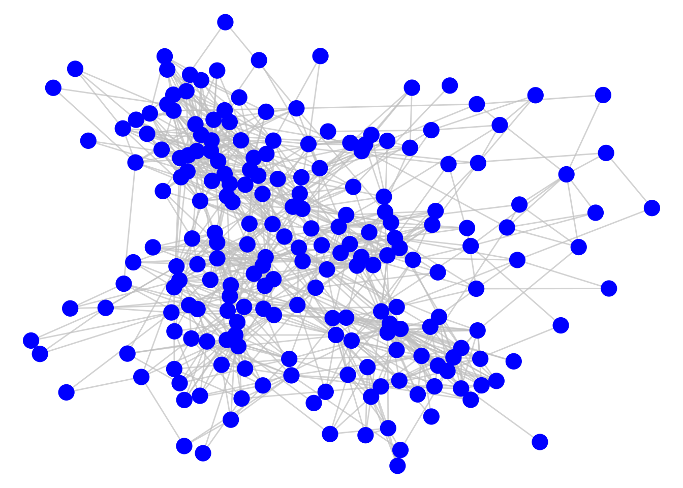
Figure 3.15: Connection of employees in a workplace as measured by spatial co-location
As it stands, this graph does not tell us much, but a couple of simple adjustments can change this. First, we can adjust the thickness of the edges to reflect the total number of minutes spent meeting, which seems a reasonable measure of the ‘strength’ or ‘weight’ of the connection. Second, we can color code the nodes by their department. The result is Figure 3.16. We can now see clusters of highly connected employees mostly driven by their department.
set.seed(123)
ggraph(workfrance, layout = "fr") +
  geom_edge_link(color = "grey", alpha = 0.7, aes(width = mins),
                 show.legend = FALSE) +
  geom_node_point(aes(color = dept), size = 5) +
  labs(color = "Department") +
  theme_void() +
  labs(title = "Spatial co-location of employees in a workplace")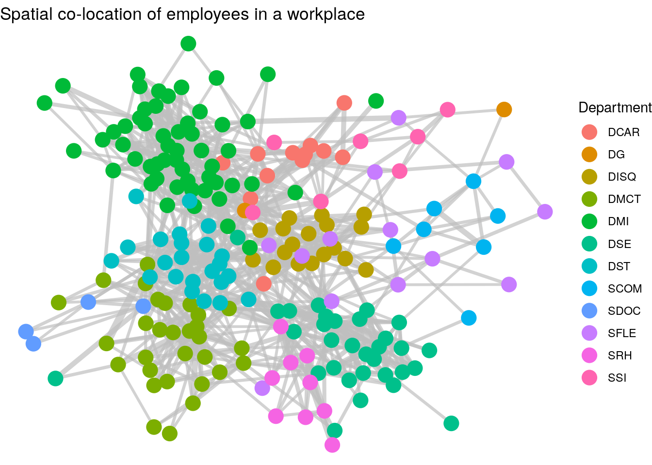
Figure 3.16: Connection of employees in a workplace with edge thickness weighted by minutes spent spatially co-located and vertices colored by department
Thinking ahead: The graph we have just created in Figure 3.16 shows how we have detected a community partition of our vertices. It’s relatively clear that individuals in the same department are more likely to be connected. Community detection is an important topic in Organizational Network Analysis which we will study later in this book. It’s not always straightforward to identify drivers of community in networks, but we will learn about a number of unsupervised community detection algorithms which will partition the graph into different community groups. As an example, Figure 3.17 shows the results of running the Louvain community detection algorithm on the workfrance graph with mins as the edge weights. You can see that the communities detected are strongly aligned with the departments in Figure 3.16.
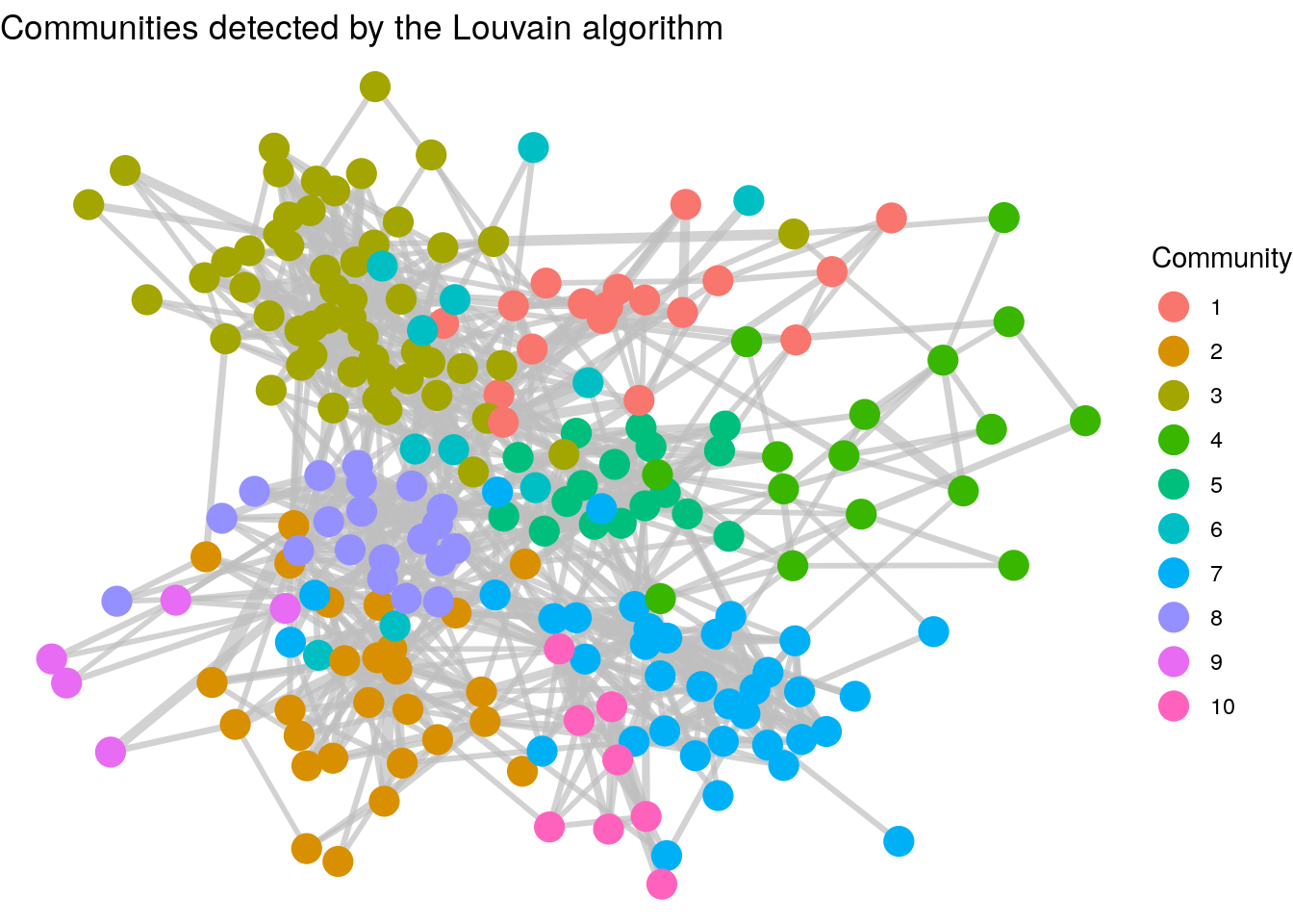
Figure 3.17: Clusters of employees as detected by the Louvain unsupervised community detection algorithm. Note the cluster similarity of communities with the departments in the previous graph.
ggraph visualizations can work relatively easily with other graphics layers, allowing you to superimpose a graph onto other coordinate systems. Let’s look at an example of this at work. Load the londontube_edgelist and londontube_vertices data sets from the onadata package or download them from the internet34. The vertex set is a list of London Tube Stations with an id, name and geographical coordinates longitude and latitude.
# download and view london tube vertex data
londontube_vertices <- read.csv(
  "https://ona-book.org/data/londontube_vertices.csv"
)
head(londontube_vertices)
## id name latitude longitude
## 1 1 Acton Town 51.5028 -0.2801
## 2 2 Aldgate 51.5143 -0.0755
## 3 3 Aldgate East 51.5154 -0.0726
## 4 4 All Saints 51.5107 -0.0130
## 5 5 Alperton 51.5407 -0.2997
## 6 7 Angel 51.5322 -0.1058The edge list represents from and to connections between stations, along with the name of the line and its official linecolor in hex code.
# download and view london tube edge data
londontube_edgelist <- read.csv(
  "https://ona-book.org/data/londontube_edgelist.csv"
)
head(londontube_edgelist)
## from to line linecolor
## 1 11 163 Bakerloo Line #AE6017
## 2 11 212 Bakerloo Line #AE6017
## 3 49 87 Bakerloo Line #AE6017
## 4 49 197 Bakerloo Line #AE6017
## 5 82 163 Bakerloo Line #AE6017
## 6 82 193 Bakerloo Line #AE6017We can easily create an igraph object from this data and then use ggraph to create a visualization using the linecolor as the edge color between stations, as in Figure 3.18.
# create a set of distinct line names and linecolors to use
lines <- londontube_edgelist |>
  dplyr::distinct(line, linecolor)

# create graph object
tubegraph <- igraph::graph_from_data_frame(
  d = londontube_edgelist,
  vertices = londontube_vertices,
  directed = FALSE
)

# visualize tube graph using linecolors for edge color
set.seed(123)
ggraph(tubegraph) +
  geom_node_point(color = "black", size = 1) +
  geom_edge_link(aes(color = line), width = 1) +
  scale_edge_color_manual(name = "Line",
                          values = lines$linecolor) +
  theme_void()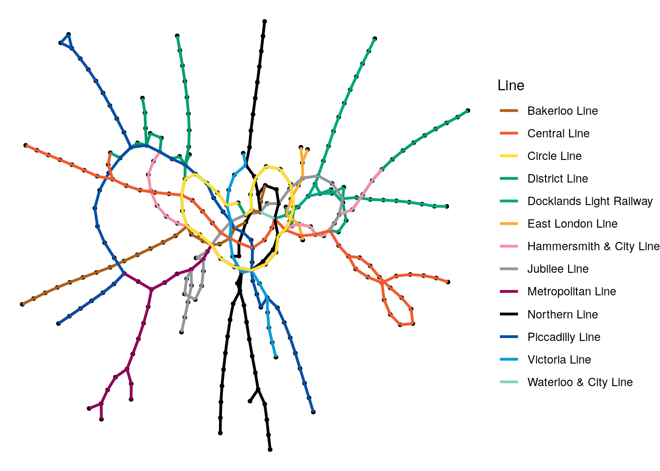
Figure 3.18: Random graph visualization of the London Tube network graph with the edges colored by the different lines
While it’s great that we can do this so easily, it’s a pretty confusing visualization for anyone who knows London. The Circle Line doesn’t look very circular, the Picadilly Line seems to he heading southeast instead of northeast. In the west, the Metropolitan and Picadilly Lines seem to have swapped places. Of course, this graph is not using geographical coordinates to plot its vertices.
We can change this by expanding our edgelist to include the latitudes and longitudes of the from and to stations in each edge, and then we can layer a map on this graph. First, let’s create those new longitude and latitude columns in the edgelist, and check that it works.
# reorganize to include longitude and latitude for start and end
new_edgelist <- londontube_edgelist |>
  dplyr::inner_join(londontube_vertices |>
                      dplyr::select(id, latitude, longitude),
                    by = c("from" = "id")) |>
  dplyr::rename(lat_from = latitude, lon_from = longitude) |>
  dplyr::inner_join(londontube_vertices |>
                      dplyr::select(id, latitude, longitude),
                    by = c("to" = "id")) |>
  dplyr::rename(lat_to = latitude, lon_to = longitude)

# view
head(new_edgelist)
## from to line linecolor lat_from lon_from lat_to lon_to
## 1 11 163 Bakerloo Line #AE6017 51.5226 -0.1571 51.5225 -0.1631
## 2 11 212 Bakerloo Line #AE6017 51.5226 -0.1571 51.5234 -0.1466
## 3 49 87 Bakerloo Line #AE6017 51.5080 -0.1247 51.5074 -0.1223
## 4 49 197 Bakerloo Line #AE6017 51.5080 -0.1247 51.5098 -0.1342
## 5 82 163 Bakerloo Line #AE6017 51.5199 -0.1679 51.5225 -0.1631
## 6 82 193 Bakerloo Line #AE6017 51.5199 -0.1679 51.5154 -0.1755That looks like it worked. Now we can use the ggmap package in R to layer a map of London on top of the base ggraph layer, and then use the various latitude and longitude columns to make our network geographically accurate, as in Figure 3.1935.
# recreate graph object to capture additional edge data
tubegraph <- igraph::graph_from_data_frame(
  d = new_edgelist,
  vertices = londontube_vertices,
  directed = FALSE
)

# layer a London map (requires Google Maps API key)
library(ggmap)
londonmap <- get_map(location = "London, UK", source = "google")

# visualize using geolocation
ggraph(tubegraph) +
  geom_blank() +
  inset_ggmap(londonmap) +
  geom_node_point(aes(x = longitude, y = latitude),
                  color = "black", size = 1) +
  geom_edge_link(aes(x = lon_from, y = lat_from,
                     xend = lon_to, yend = lat_to,
                     color = line), width = 1) +
  scale_edge_color_manual(name = "Line",
                          values = lines$linecolor)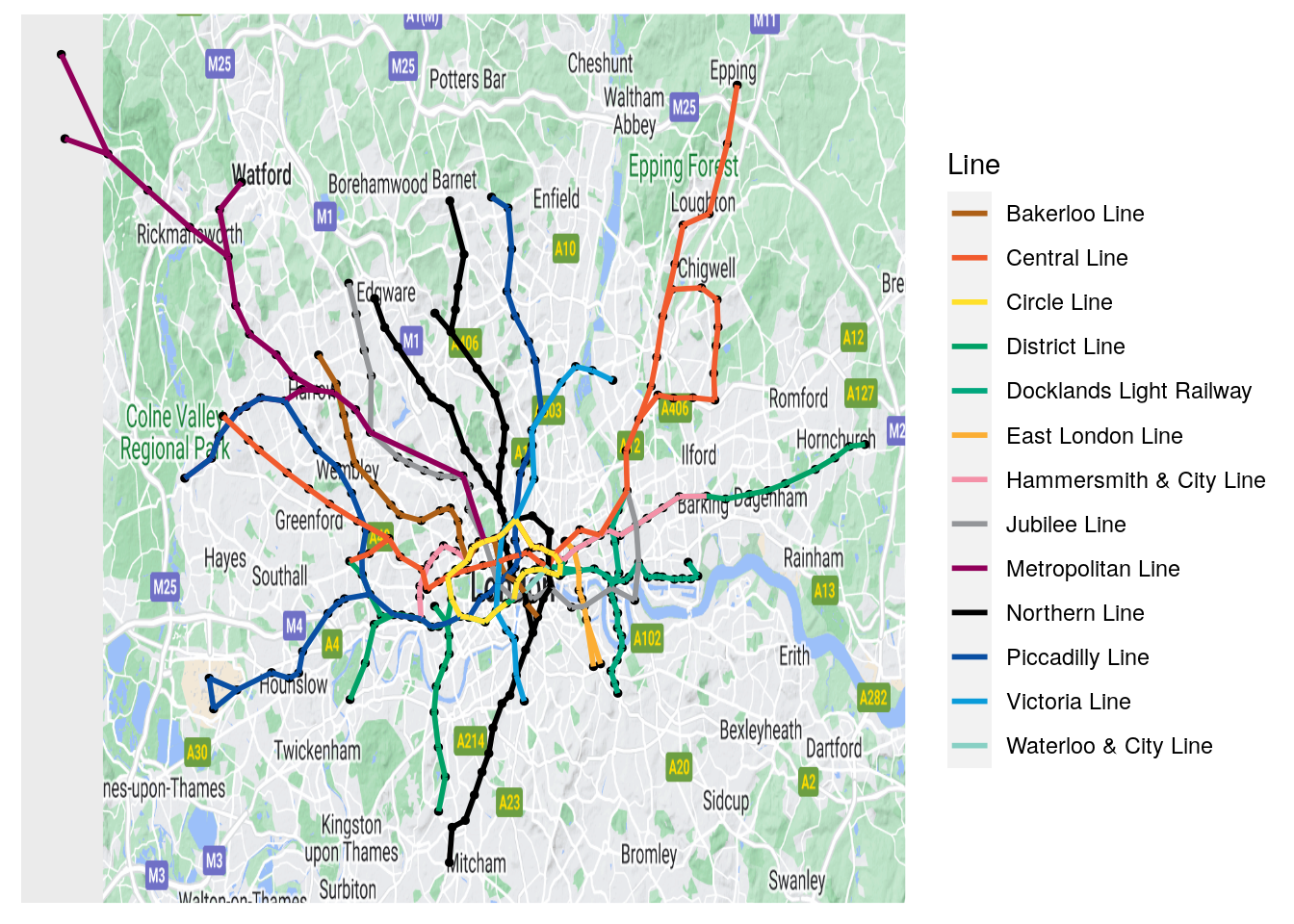
Figure 3.19: Geographically accurate London Tube network
In Figure 3.19, it looks like everything is in the right place. This kind of graphical layering can be extremely important when there is an inherent coordinate system lying behind the vertices of your graph and where none of the existing layout algorithms can recreate that coordinate system.
3.1.4 Interactive graph visualization using visNetwork
We have seen earlier how many large networks are too complicated to make sense of visually using static approaches like those we have already reviewed in igraph or ggraph. Nevertheless, interactive visualizations of networks can be useful where there is an interest in visual exploration of particular vertices or small subnetworks, even when the overall network is visually complex. We will touch upon a couple of commonly used interactive graph visualization packages here, all of which use Javascript libraries behind the scenes to create the interactive visualizations.
visNetwork is a simple but effective package which uses the vis.js API to create HTML widgets containing interactive graph visualizations. It is fairly easy to use, with its main function visNetwork() taking a dataframe of node information and a dataframe of edge information, as well as a few other optional arguments. The columns in these dataframes are expected to have certain default column names. Vertices/nodes are expected to at least have an id column but can also contain:
label: the label of the vertexgroup: the group of the vertex if there are groupsvalue: used to determine the size of the vertextitle: used as a tooltip on mouseover- Other columns can be included to be passed to specific values/properties in the visualization, such as
colororshape.
The edge dataframe must contain a from and to column, and can also contain label, value and title to customize the edges as with the vertices, as well as other properties such as arrows or dashes.
Interactive Figure 3.20 is a very simple example of the visNetwork function at work using our \(G_\mathrm{work}\) graph from Section 2.1.1. Note that the visLayout() function can be used for various customizations, including passing a random seed variable to vis.js to ensure reproducibility.
library(visNetwork)

nodes <- data.frame(
id = 1:4,
label = c("David", "Zubin", "Suraya", "Jane")
)

edges <- data.frame(
  from = c(1, 1, 1, 4, 4),
  to = c(2, 3, 4, 2, 3)
)

visNetwork(nodes, edges) |>
  visLayout(randomSeed = 123)
Figure 3.20: Simple interactive visNetwork rendering of the \(G_\mathrm{work}\) graph. Try playing with this rendering by zooming in/out or moving nodes.
In fact, assuming that we are working with igraph objects, the easiest way to deploy visNetwork is to use the visIgraph() function, which takes an igraph object and restructures it behind the scenes to use the vis.js API, even inheriting whatever igraph layout you prefer. Let’s recreate our karate graph in visNetwork, as in Interactive Figure 3.2136.
library(igraph)
library(ggraph)

# get karate edgelist
karate_edgelist <- read.csv("https://ona-book.org/data/karate.csv")

# create graph object
karate <- igraph::graph_from_data_frame(karate_edgelist,
                                        directed = FALSE)

# different colors and shapes for Mr Hi and and John A
V(karate)$color <- ifelse(V(karate)$name %in% c("Mr Hi", "John A"),
                          "lightblue",
                          "pink")

V(karate)$shape <- ifelse(V(karate)$name %in% c("Mr Hi", "John A"),
                          "square",
                          "circle")

# more visible edges
E(karate)$color = "grey"
E(karate)$width <- 3

# visualize from igraph
visNetwork::visIgraph(karate, layout = "layout_with_fr",
                      randomSeed = 123)
Figure 3.21: Interactive visNetwork rendering of the basic karate graph using a force-directed layout
Playing around: The visNetwork package allows you to take advantage of a ton of features in the vis.js API, including a wide range of graph customization, and the ability to make your graph editable or to add selector menus to search for specific nodes or groups of nodes. It’s worth experimenting with all its different capabilities. A thorough manual can be found at https://datastorm-open.github.io/visNetwork/. Why don’t you try to recreate the workfrance graph from this chapter in visNetwork?
3.1.5 Interactive graph visualization using networkD3
The networkD3 package creates responsive and interactive network visualizations using the D3 javascript library, which has some beautiful options for common network layouts like force-directed or chord diagrams.
To create a simple force-directed visualization based on an edgelist, use the simpleNetwork() function. All this needs is a simple dataframe where by default the first two columns represent the edgelist37. Here is an example for the karate network, with the result shown in Interactive Figure 3.22. Note that it is not possible to set a random seed with networkD3.
library(networkD3)

# get karate edgelist
karate_edgelist <- read.csv("https://ona-book.org/data/karate.csv")

# visualize
networkD3::simpleNetwork(karate_edgelist)
Figure 3.22: Simple interactive networkD3 rendering of the Karate graph
The forceNetwork() function allows greater levels of customization of the visualization. This function requires an edgelist and a vertex set in a specific format. However, we can use the function igraph_to_networkD3() to easily create a list containing what we need from an igraph object. In the next example, we recreate the graph in Figure 3.22, but we put Mr Hi and John A into a different group, with the result shown in Interactive Figure 3.23. Note that node names only appear when nodes are clicked.
# get karate edgelist
karate_edgelist <- read.csv("https://ona-book.org/data/karate.csv")

# create igraph object
karate <- igraph::graph_from_data_frame(karate_edgelist,
                                        directed = FALSE)

# give Mr Hi and John A a different group
V(karate)$group <- ifelse(
  V(karate)$name %in% c("Mr Hi", "John A"), 1, 2
)

# translate to networkD3 - creates a list with links and nodes dfs
# links have a source and target column and group if requested
netd3_list <- networkD3::igraph_to_networkD3(karate,
                                             group = V(karate)$group)

# visualize
networkD3::forceNetwork(
  Links = netd3_list$links,
  Nodes = netd3_list$nodes,
  NodeID = "name",
  Source = "source",
  Target = "target",
  Group = "group"
)
Figure 3.23: Interactive force-directed networkD3 rendering of the Karate graph
Other types of D3 network visualizations are also available such as chordNetwork(), and sankeyNetwork(), with many of these more appropriate for data visualization purposes than for the exploration and analysis of networks. As a quick example of using sankeyNetwork() to visualize data flows, load the eu_referendum data set from the onadata package or download it from the internet38. This shows statistics on voting by region and area in the United Kingdom’s 2016 referendum on membership of the European Union. In this example, we will calculate the ‘Leave’ and ‘Remain’ votes by region and visualize them using sankeyNetwork(), with the result shown in Interactive Figure 3.24. It is worth taking a look at the intermediate objects created by this code so you can better understand how to construct the Nodes and Links dataframes that are commonly expected by networkD3 functions.
library(dplyr)
library(networkD3)
library(tidyr)

# get data
eu_referendum <- read.csv(
  "https://ona-book.org/data/eu_referendum.csv"
)

# aggregate by region
results <- eu_referendum |>
  dplyr::group_by(Region) |>
  dplyr::summarise(Remain = sum(Remain), Leave = sum(Leave)) |>
  tidyr::pivot_longer(-Region, names_to = "result",
                      values_to = "votes")

# create unique regions, "Leave" and "Remain" for nodes dataframe
regions <- unique(results$Region)
nodes <- data.frame(node = c(0:13),
                    name = c(regions, "Leave", "Remain"))

# create edges/links dataframe
results <- results |>
  dplyr::inner_join(nodes, by = c("Region" = "name")) |>
  dplyr::inner_join(nodes, by = c("result" = "name"))

links <- results[ , c("node.x", "node.y", "votes")]
colnames(links) <- c("source", "target", "value")

# visualize using sankeyNetwork
networkD3::sankeyNetwork(
  Links = links, Nodes = nodes, Source = 'source', Target = 'target',
  Value = 'value', NodeID = 'name', units = 'votes', fontSize = 12
)
Figure 3.24: Interactive visualization of regional vote flows in the UK’s European Union Referendum in 2016 using sankeyNetwork()
Thinking ahead: As we have shown in the examples in this section, the networkD3 package offers useful, convenient ways for non-Javascript programmers to make use of many of the great capabilities of the D3 visualization library. See https://christophergandrud.github.io/networkD3/ for more examples. However, the package’s customization potential is limited. For those who can program in D3, the scope exists to create amazing interactive graph visualizations, with limitless customization potential.
3.2 Visualizing graphs in Python
We will look at two approaches to graph visualization in Python. First, we will look at static graph plotting via the networkx and matplotlib packages. Then we will look at interactive plotting via the pyvis package. As in the previous section, we will work with Zachary’s Karate Club to demonstrate most of the visualization options. Let’s load and create that graph object now.
import pandas as pd
import networkx as nx

# get edgelist as Pandas DataFrame
karate_edgelist = pd.read_csv("https://ona-book.org/data/karate.csv")

# create graph from Pandas DataFrame
karate = nx.from_pandas_edgelist(karate_edgelist,
source = 'from', target = 'to')
3.2.1 Static plotting using networkx and matplotlib
The draw() function in networkx provides a basic visualization of a graph in matplotlib using a force-directed “spring” layout, as can be seen in Figure 3.25. Remember also to set a seed to ensure reproducibility of the visualization.
import numpy as np
from matplotlib import pyplot as plt

# set seed for reproducibility
np.random.seed(123)

fig = nx.draw(karate)
plt.show()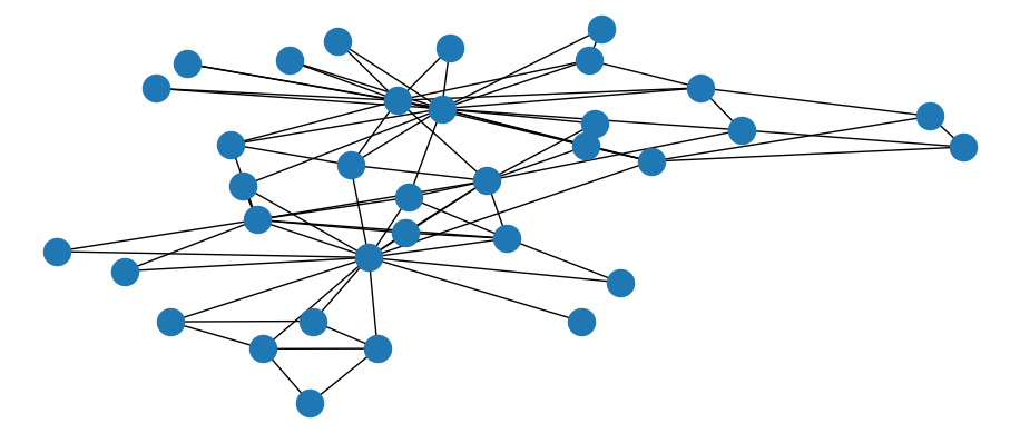
Figure 3.25: Basic static visualization of Karate network
The draw_networkx() function has a much wider range of options for customizing the appearance of graphs. For example, we can change the color of all or specific nodes or edges, or label specific nodes but not others, such as in Figure 3.26.
# set seed for reproducibility
np.random.seed(123)

# create dict with labels only for Mr Hi and John A
node = list(karate.nodes)
labels = [i if i == "Mr Hi" or i == "John A" else ""
for i in karate.nodes]
nodelabels = dict(zip(node, labels))

# create color list
colors = ["lightblue" if i == "Mr Hi" or i == "John A" else "pink"
for i in karate.nodes]

nx.draw_networkx(karate, labels = nodelabels, node_color = colors,
edge_color = "grey")
plt.show()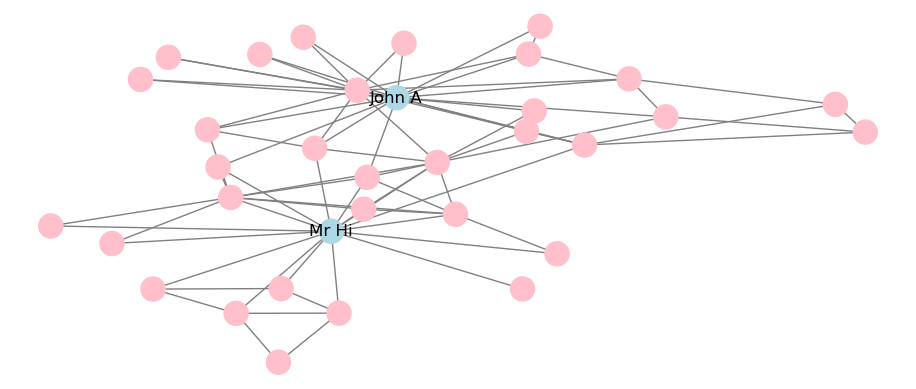
Figure 3.26: Static visualization of Karate network with adjustments to color and labeling
A limited selection of layouts is available and can be applied to the static visualization. For example, this is how to apply a circular layout, with the output in Figure 3.27.
# set seed for reproducibility
np.random.seed(123)

# circular layout
nx.draw_circular(karate, labels = nodelabels, node_color = colors,
edge_color = "grey")
plt.show()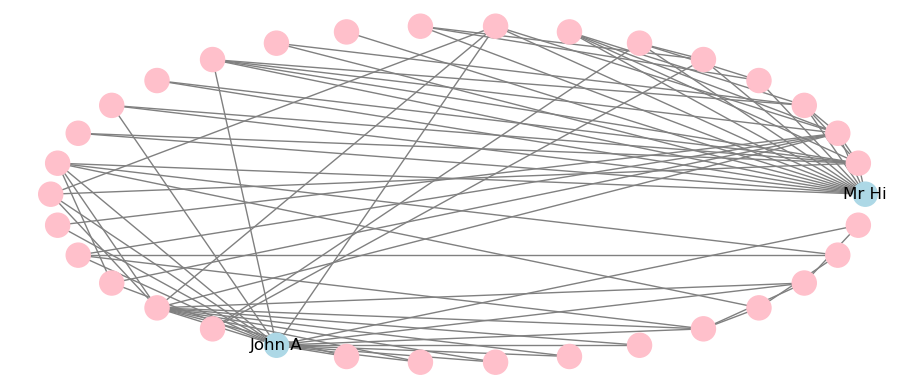
Figure 3.27: Static visualization of Karate network with circular layout
This is how to apply a Kamada-Kawai force-directed layout, with the output in Figure 3.28. Note that some layout algorithms like Kamada-Kawai make use of the scipy package and therefore this will need to be installed in your Python environment.
# set seed for reproducibility
np.random.seed(123)

# circular layout
nx.draw_kamada_kawai(karate, labels = nodelabels, node_color = colors,
edge_color = "grey")
plt.show()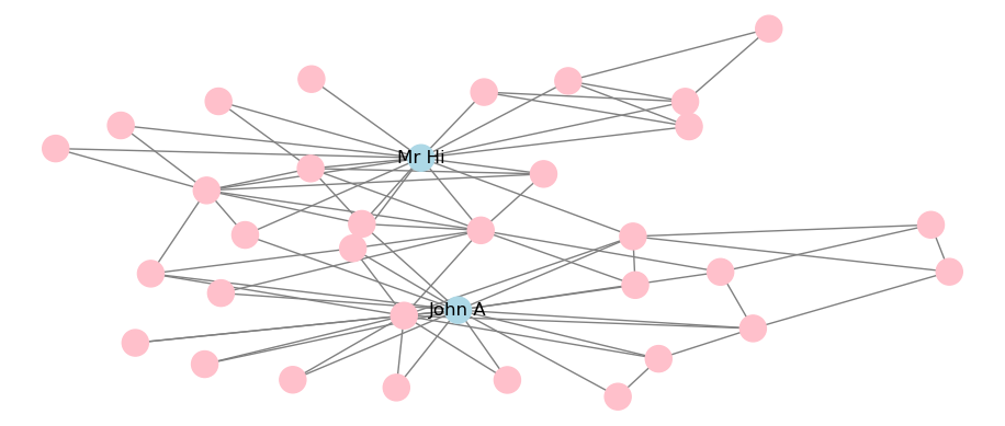
Figure 3.28: Static visualization of Karate network with Kamada-Kawai force-directed layout
Playing around: The visual capabilities of networkx in Python are more limited than igraph or ggraph in R, but there still are a range of ways to customize your visualization. Try making further changes to the visualizations shown in this section by trying different layouts or by looking at the range of arguments that can be adjusted in the draw_networkx() function. You can look up more details on all this at https://networkx.org/documentation/stable/reference/drawing.html.
3.2.2 Interactive visualization using networkx and pyvis
Similar to the visNetwork package in R, the pyvis package provides an API allowing the creation of interactive graphs using the vis.js Javascript library. As you will mostly be creating graph objects using networkx, the easiest way to use pyvis is to take advantage of its networkx integration.
To visualize a networkx graph using pyvis, start by creating a Network() class and then use the from_nx() method to import the networkx object. The show() method will render an interactive plot.
from pyvis.network import Network

# create pyvis Network object
net = Network(height = "500px", width = "600px", notebook = True)

# import karate graph
net.from_nx(karate)
net.show('out1.html')
pyvis expects specific names for the visual properties of nodes and edges, for example color and size. If these named properties are added to the nodes and edges dicts of the networkx object, they will be passed to pyvis.
# adjust colors
for i in karate.nodes:
  karate.nodes[i]['size'] = 20 if i == "Mr Hi" or i == "John A" \
  else 10

  karate.nodes[i]['color'] = "lightblue" if i == "Mr Hi" \
  or i == "John A" else "pink"

# create edge color
for i in karate.edges:
  karate.edges[i]['color'] = "grey"

# create pyvis Network object
net = Network(height = "500px", width = "600px", notebook = True)

# import from networkx to pyvis and display
net.from_nx(karate)
net.show('out2.html')
Playing around: Different user interface controls can be added directly onto your pyvis visualizations using the show_buttons() method allowing you to experiment directly with the graph’s look and feel. For example, you can add buttons to experiment with the physics of the force-directed layout, or the node or edge properties. This can be useful when you are experimenting with options. You can learn more at the tutorial pages at https://pyvis.readthedocs.io/en/latest/.
3.3 Learning exercises
3.3.1 Discussion questions
- Why is visualization an important consideration when studying graphs?
- Describe some ways a graph visualization can be adjusted to reflect different characteristics of the vertices. For example, how might we represent more ‘important’ vertices visually?
- Describe some similar adjustments that could be made to the edges.
- Describe some likely challenges with large graph visualizations which may make it harder to draw conclusions from them.
- What is the difference between a static and an iteractive visualization? In what ways might interactive visualizations overcome some of the challenges associated with large static graph visualizations?
- Choose your favorite programming language and list out some package options for how to visualize graphs in that language.
- For each package option you listed, describe what kinds of graphs each package would be best suited for.
- Describe what is meant by a graph layout.
- List some layout options which are available in the packages you selected for Questions 6 and 7.
- If you visualize the same graph twice using the same layout, the outputs may look different. Why is this the case and what can be done to control it?
3.3.2 Data exercises
Load the madmen_vertices and madmen_edges data sets from the onadata package or download them from the internet39. This represents a network of characters from the TV show Mad Men with two characters connected by an edge if they were involved in a romantic relationship together.
- Create a graph object from these data sets.
- Create a basic visualization of the network using one of the methods from this chapter.
- Adjust your visualization to distinguish between Male and Female characters.
- Adjust your visualization to highlight the six main characters.
- Adjust your visualization to differentiate between relationships where the characters were married or not married.
- Experiment with different layouts. Which one do you prefer and why?
Now load the schoolfriends_vertices and schoolfriends_edgelist data sets from the onadata package or download them from the internet40. This data set represents friendships reported between schoolchildren in a high school in Marseille, France in 2013. The vertex set provides the ID, class and gender of each child, and the edgelist has two types of relationships. The first type is a reported friendship where the from ID reported the to ID as a friend. The second type is a known Facebook friendship between the two IDs.
- Create two different graph objects—one for the reported friendship and the other for the Facebook friendship. Why is one graph object different from the other?
- Create a basic visualization of both graphs using a method of your choice. Try to create versions of the graphs that contain isolates (nodes not connected to others) and do not contain isolates.
- Experiment with different layouts for your visualization. Which one do you prefer and why? Do you see any potential communities in these graphs? Which type of friendship appears to be more ‘selective’ in your opinion?
- Adjust both visualizations to differentiate the vertices by gender. Which type of relationship is more likely to be gender-agnostic in your opinion? Try the same question for class differentiation.
References
The right-hand visualization uses the degree centrality of the vertices to scale their size—we will learn about this later. The layouts are also different. The left-hand visualization uses a grid layout, while the right-hand visualization uses a metric multidimensional scaling (MDS) layout.↩︎
Note that this means that the process is usually computationally expensive on large graphs and can easily freeze up your machine if you are not careful.↩︎
The multigraph visualization in Figure 2.4 was generated using the Sugiyama layout algorithm.↩︎
To learn
ggplot2as a foundational package, Wickham (2016) is highly recommended.↩︎https://ona-book.org/data/workfrance_edgelist.csv and https://ona-book.org/data/workfrance_vertices.csv↩︎
This data set has been further processed from the original data set, including limiting the edges to those where the total co-location time was at least 5 minutes.↩︎
https://ona-book.org/data/londontube_edgelist.csv and https://ona-book.org/data/londontube_vertices.csv↩︎
A Google Maps API key is needed to use
ggmap- see https://github.com/dkahle/ggmap for more information.↩︎Note that if you are passing an
igraphlayout tovisNetwork, you will need to use therandomSeedargument directly in thevisIgraph()function.↩︎You can use the arguments in the
simpleNetwork()function to define the Source and Target columns if they are not the first two columns↩︎https://ona-book.org/data/madmen_vertices.csv and https://ona-book.org/data/madmen_edges.csv↩︎
https://ona-book.org/data/schoolfriends_vertices.csv and https://ona-book.org/data/schoolfriends_edgelist.csv↩︎