11 Bonus Chapter: Advanced Network Visualization using D3
In Chapter 3, we reviewed a very wide range of options for visualizing network graphs in both R and Python, ranging from static visualizations through to interactive visualizations using Javascript data visualization libraries such as D3.js and vis.js. In these chapters we built our interactive graphs through using helpful packages that translate between R or Python and Javascript, so that users did not need to have knowledge of Javascript to take advantage of them.
However, to have the widest range of flexibility to develop and customize interactive and compelling network visualizations, there are many advantages to be able to code these visualizations natively and directly in Javascript. In this chapter we will outline a a couple of examples of this using the Data Driven Documents (D3) library. D3 is an extemely popular and flexible library for designing data visualizations, and contains useful functions for different graph layouts. We will start by converting our graph data into a JSON format for use in Javascript using R. We will then move to Javascript and use some standard D3 functions for network visualization, customizing them to achieve a desired look. Finally we will embed this in a webpage that allows users to interact with the visualization, and show examples of how additional interactive features such as sliding scales can be added to the standard visualization.
We will use the example of the British MP Twitter network from Bonus Chapter 10 as an illustrative example in this chapter.
11.1 Writing graph data in JSON form for use in Javascript
To write graph data into JSON form, our first step is to create an igraph object which has all the properties we intend to use in the visualization. We start by loading the British MP Twitter network data that was created in Bonus Chapter 10.
mp_edgelist <- read.csv("https://ona-book.org/data/mp_edgelist.csv")
mp_vertices <- read.csv("https://ona-book.org/data/mp_vertices.csv")
Recall the contents of these dataframes. The mp_edgelist dataframe contains the edges of the network with from and to columns containing MP Twitter handles and a weight property which indicates the strength of the Twitter connection between the two MPs.
head(mp_edgelist)## from to weight
## 1 _OliviaBlake Afzal4Gorton 2
## 2 _OliviaBlake alanwhiteheadmp 4
## 3 _OliviaBlake Alex_Stafford 4
## 4 _OliviaBlake alexsobel 4
## 5 _OliviaBlake AlokSharma_RDG 1
## 6 _OliviaBlake AndyMcDonaldMP 2The mp_vertices contains a set of information about each MP, which will be used as vertex properties in the network.
head(mp_vertices)## screen_name profile_image_url
## 1 LindsayHoyle_MP http://pbs.twimg.com/profile_images/1219208145471516672/d5uiK99E_normal.jpg
## 2 ClaireHanna http://pbs.twimg.com/profile_images/1229882927082803200/cd9N4yaE_normal.jpg
## 3 columeastwood http://pbs.twimg.com/profile_images/1503856507229777921/vtRXBZyB_normal.jpg
## 4 MickeyBradySF http://pbs.twimg.com/profile_images/1240647475171676163/HO8w04kr_normal.jpg
## 5 PaulMaskeyMP http://pbs.twimg.com/profile_images/1394647673203040256/3pHc3qER_normal.jpg
## 6 FrancieMolloy http://pbs.twimg.com/profile_images/2966488222/0e09c703ed91b0f3f7b48ebddf6bb2eb_normal.jpeg
## followers_count constituency party name colour
## 1 41560 Chorley Speaker Lindsay Hoyle #000000
## 2 41802 Belfast South Social Democratic and Labour Party Claire Hanna #216a4d
## 3 47402 Foyle Social Democratic and Labour Party Colum Eastwood #216a4d
## 4 5366 Newry and Armagh Sinn Féin Mickey Brady #008a49
## 5 20281 Belfast West Sinn Féin Paul Maskey #008a49
## 6 9035 Mid Ulster Sinn Féin Francie Molloy #008a49We will now proceed to create a graph from this data using igraph in R. For our purposes in this chapter we will create an undirected graph.
library(igraph)

# create undirected graph
(mp_graph <- igraph::graph_from_data_frame(
  mp_edgelist,
  vertices = mp_vertices,
  directed = FALSE
))
## IGRAPH bd69cea UNW- 585 26833 --
## + attr: name (v/c), profile_image_url (v/c), followers_count (v/n), constituency (v/c), party (v/c), colour
## | (v/c), weight (e/n)
## + edges from bd69cea (vertex names):
## [1] Olivia Frances Blake--Afzal Khan Olivia Frances Blake--Dr Alan Whitehead
## [3] Olivia Frances Blake--Alexander Stafford Olivia Frances Blake--Alex Sobel
## [5] Olivia Frances Blake--Alok Sharma Andy McDonald --Olivia Frances Blake
## [7] Angela Crawley --Olivia Frances Blake Olivia Frances Blake--Angela Rayner
## [9] Olivia Frances Blake--Anna McMorrin Olivia Frances Blake--Anneliese Dodds
## [11] Olivia Frances Blake--Apsana Begum Olivia Frances Blake--Bambos Charalambous
## [13] Olivia Frances Blake--Boris Johnson Olivia Frances Blake--Bridget Phillipson
## + ... omitted several edgesWe can see that our graph contains all the data from our dataframes as vertex and edge properties.
Next we will add the degree centrality of each vertex as a vertex property to allow us to use this to control vertex size in our visualizations.
V(mp_graph)$degree <- igraph::degree(mp_graph)Now we will use the networkD3 package in R to convert our igraph object into a list format that can be understood by D3.js network functions. We will need to let this function know how to group the vertices for the purposes of visualization - in this case we choose to group by party.
library(networkD3)
D3data <- networkD3::igraph_to_networkD3(
  mp_graph,
  group =V(mp_graph)$party
)
This creates a list containing two objects: links, which the edgelist of the network, and nodes which are the vertices:
head(D3data$links)## source target value
## 1 1 392 2
## 2 332 392 1
## 3 295 392 1
## 4 319 392 3
## 5 364 392 4
## 6 73 392 2head(D3data$nodes)## name group
## 1 Lindsay Hoyle Speaker
## 2 Claire Hanna Social Democratic and Labour Party
## 3 Colum Eastwood Social Democratic and Labour Party
## 4 Mickey Brady Sinn Féin
## 5 Paul Maskey Sinn Féin
## 6 Francie Molloy Sinn FéinWe will now add some other vertex properties to the nodes object, and we will create a new property which is a URL link to the Twitter profile of the MP:
D3data$nodes$followers <- V(mp_graph)$followers_count
D3data$nodes$url <- V(mp_graph)$profile_image_url
D3data$nodes$colour <- V(mp_graph)$colour
D3data$nodes$constituency <- V(mp_graph)$constituency
D3data$nodes$degree <- V(mp_graph)$degree
Finally, we will use the jsonlite package write this data to a JSON file ready for use in Javascript:
library(jsonlite)
jsonlite::write_json(D3data, "D3data.json")
This will write the data into a JSON file in your local R session. I have made this JSON file available as a download for convenience. You can see the contents by navigating to https://ona-book.org/data/D3data.json. It is a long set of key-value pairs which contain all of the information we loaded into our graph above. You may need to scroll a long way down to see the full set of node data.
11.2 Generating the basic MP Twitter graph in D3.js
In this section we will write the code to display a simple force-directed network for the MP graph colored by party. We will start with just the basic graph and then progressively add more interesting features to the visualization. This code uses v4 of the D3 library at https://d3js.org/d3.v4.min.js.
First we define the svg container which we will build our visualization in and give it width and height attributes.
// start svg
var svg = d3.select("svg"),
    width = +svg.attr("width"),
    height = +svg.attr("height");
We now create a D3 simulation object with various parameters, an SVG element group which will make up our network graph and a path to where we will get our data from, which is the JSON we created earlier.
var simulation = d3.forceSimulation()
    .force("link", d3.forceLink())
    .force("charge", d3.forceManyBody().strength([-120]).distanceMax([500]))
    .force("center", d3.forceCenter(width / 2, height / 2));

var container = svg.append('g');

var dataPath = "https://ona-book.org/data/D3data.json";
We will create a zooming function to allow users to zoom in and out of the visualization in the svg container.
// Zooming function translates the size of the svg container.
function zoomed() {
    container.attr(
    "transform",
    "translate(" + d3.event.transform.x + ", " + d3.event.transform.y + ") scale(" + d3.event.transform.k + ")"
  );
}

// Call zoom for svg container.
svg.call(d3.zoom().on('zoom', zoomed));
Now we will write a master function to generate the graph. The following code for the rest of this section will sit inside a function function(error, graph) to be applied to a JSON dataset via d3.json(). First we will need to instruct the function to throw an error if there is a problem with the dataset.
if (error) throw error;Now we create a function to scale the radius of the nodes to correspond to the degree centrality measure in the JSON, so that more connected individuals get larger nodes, and we set a minimum radius of 8 pixels and a maximum of 25 pixels. We will also use this scaling to control collision detection in the force-directed network.
// Linear scale for degree centrality.
var degreeSize = d3.scaleLinear()
  .domain(
    [d3.min(graph.nodes, d => d.degree),
     d3.max(graph.nodes, d => d.degree)
    ]
   )
  .range([8,25]);

// Collision detection based on degree centrality.
simulation.force("collide", d3.forceCollide().radius(d => degreeSize(d.degree)));
Now we create the node and the edge objects. We will just color the edges a light grey here.
var link = container.append("g")
  .attr("class", "links")
  .selectAll("line")
  .data(graph.links, d => d.source + ", " + d.target)
  .enter().append("line")
  .attr('class', 'link')
  .style('stroke', '#808080');

var node = container.selectAll(".node")
  .data(graph.nodes)
  .enter()
  .append("g")
  .attr("class", "node");
Now we will give the nodes a circle appearance with a radius according to our previous degreeSize function, and a colour according to the political party color in the JSON.
node.append("circle")
  // Scale based on degree centrality
  .attr('r', d => degreeSize(d.degree))
  .attr('cx', d => d.x)
  .attr('cy', d => d.y)
  // Color by group (political party)
  .attr("fill", d => d.colour)
  .attr('class', 'node')
Now we will add informative tooltips to the nodes containing information on each of them, including the MPs party, constituency and followers count.
node.append("title")
  .text(d => d.name + '\nParty: ' + d.group + '\nConstituency: ' + d.constituency + '\nFollowers: ' + d.followers.toString());
Now, as the force directed graph loads, the nodes will be moving for a period of time as the algorithm tries to find an equilibrium. We will want to see this in action, so we will need to write a function to ensure node and edge positioning updates on each tick as the algorithm progresses. Then we apply this to the nodes and edges.
function ticked() {
  // update edge coords
  link
    .attr("x1", d => d.source.x)
    .attr("y1", d => d.source.y)
    .attr("x2", d => d.target.x)
    .attr("y2", d => d.target.y);

  // update node coords
  node
    .attr("transform", d => "translate(" + d.x + "," + d.y + ")");
}

// run ticked function and move nodes on every tick
simulation
  .nodes(graph.nodes)
  .on("tick", ticked);

// update edges immediately
simulation.force("link")
  .links(graph.links);
This is all we need for our simple version of the graph. Now we will save this as mptwitter_d3_simple.js in a js folder, and then we can create a simple HTML file called mp_twitter_simple.html to call in this visualization.
<!DOCTYPE html>
<meta charset="utf-8">
<body>
<div class="row">
  <center>
    <svg width="2000" height="800"></svg>
  </center>
  <script src="https://d3js.org/d3.v4.min.js"></script>
  <script src="js/mptwitter_d3_simple.js"></script>
</div>
</body>
You can see the full Javascript code for this here. This should produce a visualization such as that which is statically rendered in Figure 11.1, which will gradually move and settle into an equilibrium. You can visit the end product graph and play with it here. Note that hovering over nodes will reveal the tooltip information.
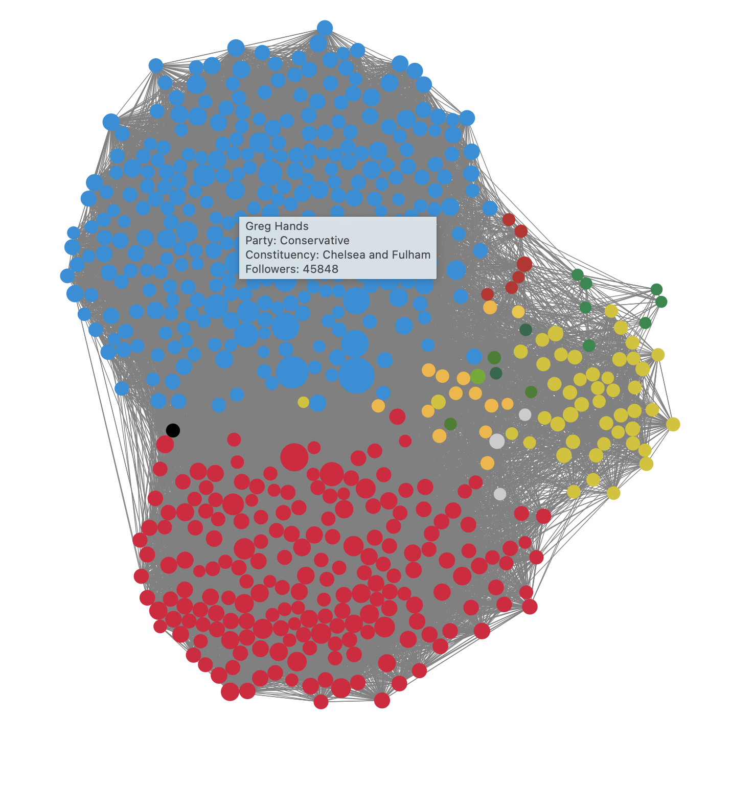
Figure 11.1: Static rendering of the basic MP Twitter network in D3
11.3 Adding advanced features to the MP Twitter graph
The beauty of working in Javascript is the seemingly endless flexibility for adding user interaction features. In this section we will illustrate ways to enhance the graph we created in the previous section with a variety of compelling and fun interactive features.
11.3.1 Adding MP photos to the nodes
To help users better recognize an MP in the visualization, we could add the MP’s Twitter profile image onto the respective node. Since we have included the URL of the image in our JSON data, this should not be too challenging to do.
First we create a pattern for each node, and give it an ID which we will associate with the URL of the profile image for the node. We give the pattern a specific positioning, height and width and then we append the profile image with the same height and width.
node
  .append("defs")
  .append("pattern")
  .attr('id', d => 'image-' + d.name.split(" ").join(""))
  .attr('patternUnits', 'userSpaceOnUse')
  .attr('x', d => -degreeSize(d.degree))
  .attr('y', d => -degreeSize(d.degree))
  .attr('height', d => degreeSize(d.degree) * 2)
  .attr('width', d => degreeSize(d.degree) * 2)
  .append("image")
  .attr('height', d => degreeSize(d.degree) * 2)
  .attr('width', d => degreeSize(d.degree) * 2)
  .attr('xlink:href', d => d.url);
We then append another circle on each node and fill this circle almost completely with the associated pattern we created. We don’t fill the entire circle as we want to keep the party colour as a border on the node around the Twitter profile image.
node
  .append("circle")
  .attr('r', d => 0.9 * degreeSize(d.degree))
  .attr('fill', d => 'url(#image-' + d.name.split(" ").join("") + ')');
If we insert this towards the end of our d3.json() master function, this will work nicely.
11.3.2 Visualize the neighbours of an MP on click
Given the full graph is so complex, it might be nice to click on a specific MP and see just their network of neighbours. To do this we will want to toggle a function that reduces the opacity of all those links and nodes which are not in that MPs network. So first we set a toggle variable early in our code and set it to zero.
var toggle = 0;We also create a list of neighbouring nodes from our JSON, and write a function which searches that list to determine if two nodes are neighbours. This code will need to be placed early in the d3.json() master function.
// Make object of all neighboring nodes.
var linkedByIndex = {};
graph.links.forEach(function(d) {
  linkedByIndex[d.source + ',' + d.target] = 1;
  linkedByIndex[d.target + ',' + d.source] = 1;
});

// A function to test if two nodes are neighbours.
function neighboring(a, b) {
  return linkedByIndex[a.index + ',' + b.index];
}
Next we append some new conditional opacity attributes to the circles containing the Twitter profile images, and to the edges connecting to the neighbours. If the toggle is off, we set these opacity attributes to highlight the neighbours, and if it is on, we set the opacity attributes to unhighlight them. We do this using ternary operators.
// adding on click functionality to the circles containing the Twitter images
node
  .append("circle")
  .attr('r', d => 0.9 * degreeSize(d.degree))
  .attr('fill', d => 'url(#image-' + d.name.split(" ").join("") + ')');
// On click, toggle ego networks for the selected node
  .on('click', function(d) {
    if (toggle == 0) {
      // Ternary operator restyles links and nodes if they are adjacent.
      d3.selectAll('.link').style('stroke-opacity', function (l) {
        return l.target == d || l.source == d ? 1 : 0.1;
      });
      d3.selectAll('.node').style('opacity', function (n) {
        return neighboring(d, n) ? 1 : 0.1;
      });
      toggle = 1;
    }
    else {
      // Restore nodes and links to normal opacity.
      d3.selectAll('.link').style('stroke-opacity', '0.6');
      d3.selectAll('.node').style('opacity', '1');
      toggle = 0;
    }
  })
11.3.3 Allowing users to drag nodes and reposition them
Users sometimes like to play with nodes and reposition them in the network to see how the force-directed algorithm adjusts to this new position of the node. To do this, we just need to define some drag functions that we can apply to our circles containing the Twitter profile images.
function dragstarted(d) {
  if (!d3.event.active) simulation.alphaTarget(0.3).restart();
  d.fx = d.x;
  d.fy = d.y;
}

function dragged(d) {
  d.fx = d3.event.x;
  d.fy = d3.event.y;
}

function dragended(d) {
  if (!d3.event.active) simulation.alphaTarget(0);
  d.fx = null;
  d.fy = null;
}
We can then apply these functions to D3’s drag gestures by calling them on the circles containing the Twitter profile images.
// to be added to the Twitter image circles after the neighbour opacity code
.call(d3.drag()
        .on("start", dragstarted)
        .on("drag", dragged)
        .on("end", dragended));
11.3.4 Adding a search box to search and highlight a specific MP name
With nearly 600 MPs in the network, it’s hard to find a specific MP, and so an ability to search by name would be extremely useful. For this we will need to add a form containing a text box and a search button to the body of our web page, so these variables will need to be added to the early code.
// Create form for search.
var search = d3.select("body")
  .append('center')
  .append('form')
  .attr('onsubmit', 'return false;');

var box = search.append('input')
  .attr('type', 'text')
  .attr('id', 'searchTerm')
  .attr('placeholder', 'Type MP name to search...');

var button = search.append('input')
  .attr('type', 'button')
  .attr('value', 'Search')
  .on('click', () => searchNodes());
Our button calls a function called searchNodes(), but we haven’t written it yet. Let’s write this function so that it makes everything except the nodes that match the search term disappear for 5 seconds and then return.
// Make all non-matching nodes and all edges disappear for 5 seconds.
function searchNodes() {
  var term = document.getElementById('searchTerm').value;
  var selected = container.selectAll('.node').filter(function (d) {
    return d.name.toLowerCase().search(term.toLowerCase()) == -1;
  });
  selected.style('opacity', '0');
  var link = container.selectAll('.link');
  link.style('stroke-opacity', '0');
  d3.selectAll('.node')
    .transition()
    .duration(5000)
    .style('opacity', '1');
  d3.selectAll('.link')
    .transition()
    .duration(5000)
    .style('stroke-opacity', '0.6');
}
Now we have a nice feature where the nodes that match the search appear temporarily by themselves so the user can see where they are in the network.
11.3.5 Adjusting the criteria for nodes to be adjacent/connected
Recall that our JSON links contain a value key, which is the weight of the edge between the two MPs. Recall that this represents a measure of the strength of the connection of the two MPs based on the number of Twitter interactions between them. Given that our initial graph is complex and contains tens of thousands of edges, users may wish to apply a higher criteria to the number of interactions that define a link between two MPs.
To do this, we can create a slider in the body of our web page, and give the slider a range of values from 1 to, say, half the maximum value in the JSON. We can then use the slider value to recalculate the edges of the graph using this value as a threshold.
First, let’s create the slider.
var slider = d3.select('body')
  .append('p')
  .append('center')
  .text('Minimum Twitter interactions for connection: ')
  .style('font-size', '75%');
Then, towards the end of our master function, we can create the conversation between the slider and the graph. We can give the slider an initial threshold label of 1. We can give it an input range from 1 up to half or the maximum value of the edges.
Upon a change of input from the slider, we run a function which takes the new threshold value, pushes a new set of edges based on that threshold. We keep all the nodes in the visualization but we now only connect edges which have the required threshold. We then refresh the graph and restart the force directed similation.
slider.append('label')
  .attr('for', 'threshold')
  .text('1').style('font-value', 'bold')
  .style('font-size', '120%');

slider.append('input')
  .attr('type', 'range')
  .attr('min', 1)
  .attr('max', d3.max(graph.links, d => d.value/2)
  .attr('value', 1)
  .attr('id', 'threshold')
  .style('width', '50%')
  .style('display', 'block')
  .on('input', function () {
    var threshold = this.value;

    d3.select('label').text(threshold);

    // Find the links that are at or above the threshold.
    var newData = [];
    graph.links.forEach( function (d) {
      if (d.value >= threshold) {newData.push(d); };
    });

    // Data join with only those new links.
    link = link.data(newData, d => d.source + ', ' + d.target);
    link.exit().remove();
    var linkEnter = link.enter().append('line').attr('class', 'link').style('stroke', '#808080');
    link = linkEnter.merge(link);

    node = node.data(graph.nodes);

    // Restart simulation with new link data.
    simulation
      .nodes(graph.nodes).on('tick', ticked)
      .force("link").links(newData);

    simulation.alphaTarget(0.1).restart();

  });
This leads to a fun feature where the disconnected nodes (isolates) float off into space and we are left with simpler and smaller connected components.
11.3.6 Wrapping the graph in a more stylish web design
Given the effort we have put into creating all these cool features, it would be a shame not to make some finishing touches to the styling of the webpage that we will embed it in. Once we save our Javascript code in the js folder using the filename mptwitter_d3.js, there are a few simple tweaks we can make to the HTML code to really improve the overall look and feel.
By consulting the brand guide for the UK Parliament, we can find the colour associated with the House of Commons, and we can also choose a free Google typeface as close as possible to the one recommended - in this case I will use Cinzel serif for the various text elements of the web page. Below is some enhanced HTML code to include this styling, which I will save as mp_twitter.html.
<!DOCTYPE html>
<meta charset="utf-8">
<link rel="preconnect" href="https://fonts.googleapis.com">
<link rel="preconnect" href="https://fonts.gstatic.com" crossorigin>
<link href="https://fonts.googleapis.com/css2?family=Cinzel&family=Source+Sans+Pro:wght@300;600&display=swap" rel="stylesheet">
<style>
body {
  font-family: 'Cinzel', serif;
  color: #4A7729;
  background-color: #ffffff;
}

.links line {
  stroke: #999;
  stroke-opacity: 0.6;
}

.nodes circle {
  stroke: #fff;
  stroke-width: 1.5px;
}
</style>
<body>
  <div class="row">
    <center>
      <h1>
        House of Commons MP Twitter Network
      </h1>
    </center>
  </div>
<div class="row">
  <center>
    <svg width="2000" height="800"></svg>
  </center>
  <script src="https://d3js.org/d3.v4.min.js"></script>
  <script src="js/mptwitter_d3.js"></script>
</div>
</body>
You can see the full Javascript code including all the enhancements to the graph here. The resulting graph fully styled looks like the static image in Figure 11.2, while Figure 11.3 shows the graph when then slider has been used to raise the connection threshold to 56 Twitter interactions. You can play with the final product here.
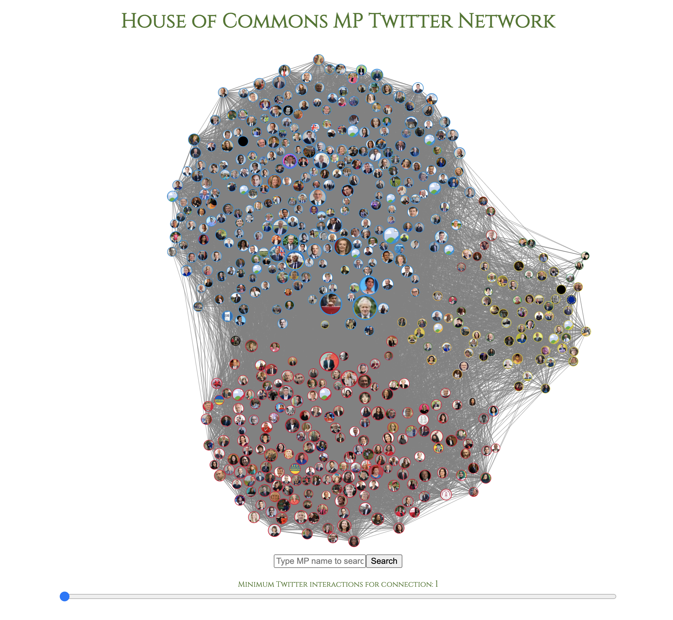
Figure 11.2: Fully styled MP Twitter network in D3
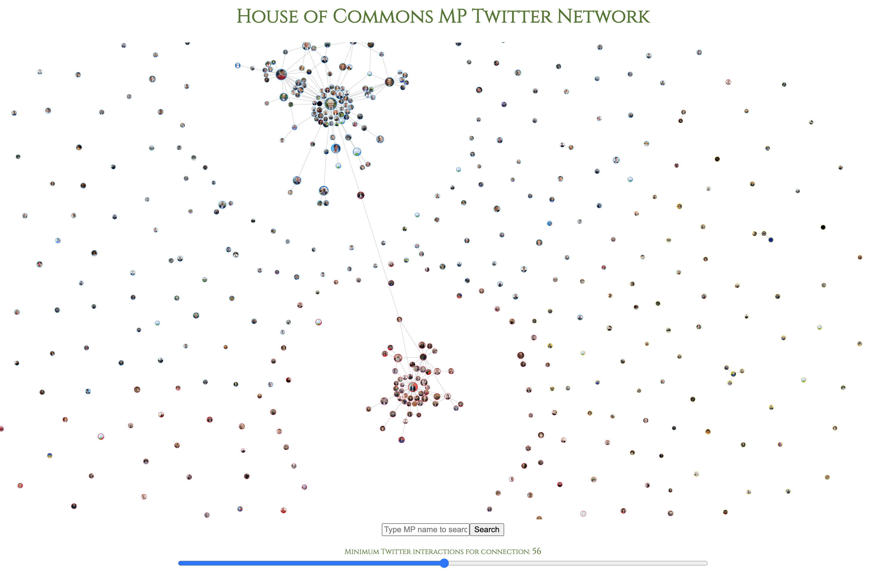
Figure 11.3: MP Twitter network in D3 with connection threshold raised to 56 Twitter interactions